Selected Product Work
SB Nation Community Advertising Platform
Native advertising that belongs in the conversation
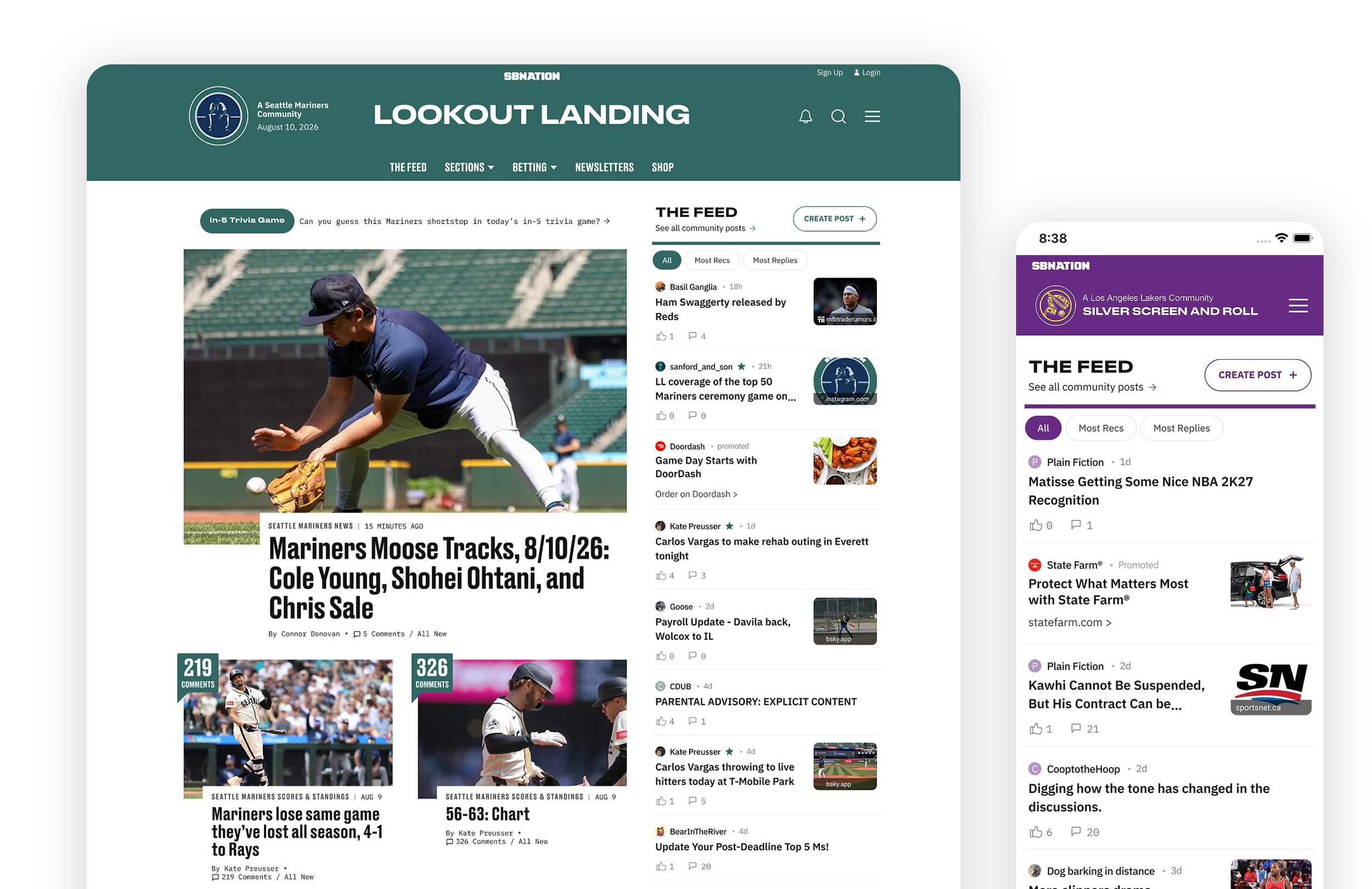
A scalable native advertising platform that brought paid placements into SB Nation’s community feeds without compromising the conversations that made them valuable.
At a glance
SB Nation sought to unlock a new revenue opportunity within its fan communities, where high levels of page views and engagement had not yet been translated into premium advertising inventory.
I led the strategy and design of a scalable native advertising platform that expanded monetizable inventory without disrupting the community experience that made them valuable.
Outcome: Increased campaign value by 11% with no notable decline in community page views or user content after six months.
Role
Lead Product Designer throughout discovery, design, implementation, and launch
Timeline
May 2025 - Nov 2025
Team
1 Product Manager • 1 Product Director • 2 Engineers • 1 Product Designer (me)
Partners
Advertising Operations • Sales • Editorial • QA
Responsibilities
Product strategy • UX architecture • Systems design • Interaction design • Prototyping • Design specifications • Cross-functional collaboration
Business Opportunity
Shift revenue toward the platform's most resilient source of engagement.
The existing revenue strategy was primarily generated through homepage and article display advertising, but AI changed how people discovered content and search-driven traffic became less reliable across digital publishing. Leadership responded by shifting investment toward products built on engagement that AI couldn't easily replace.
SB Nation's fan communities became the strategic priority because user-generated posts consistently drove impressions and engagement but community pages were unmonetized. Expanding community page inventory created an opportunity to grow revenue from engagement that the platform already had.
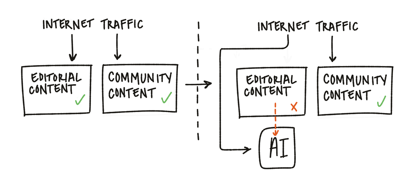
AI answers divert search traffic from publishers
The Challenge
Expand monetization opportunities without disrupting the community experience.
Community pages were valuable because they kept readers immersed in discussion. Adding advertising risked disrupting that experience and reducing the engagement the business was trying to monetize.
The solution needed to balance three competing priorities:
Give advertisers meaningful visibility within the feed
Preserve the reading flow that encouraged users to stay, read, and participate
Create a reusable product that could scale across nearly 200 communities without introducing operational complexity
The product needed to work across desktop and mobile, integrate with internal campaign management and future self-service tools, and establish reusable components that could remain flexible for future platform expansions.
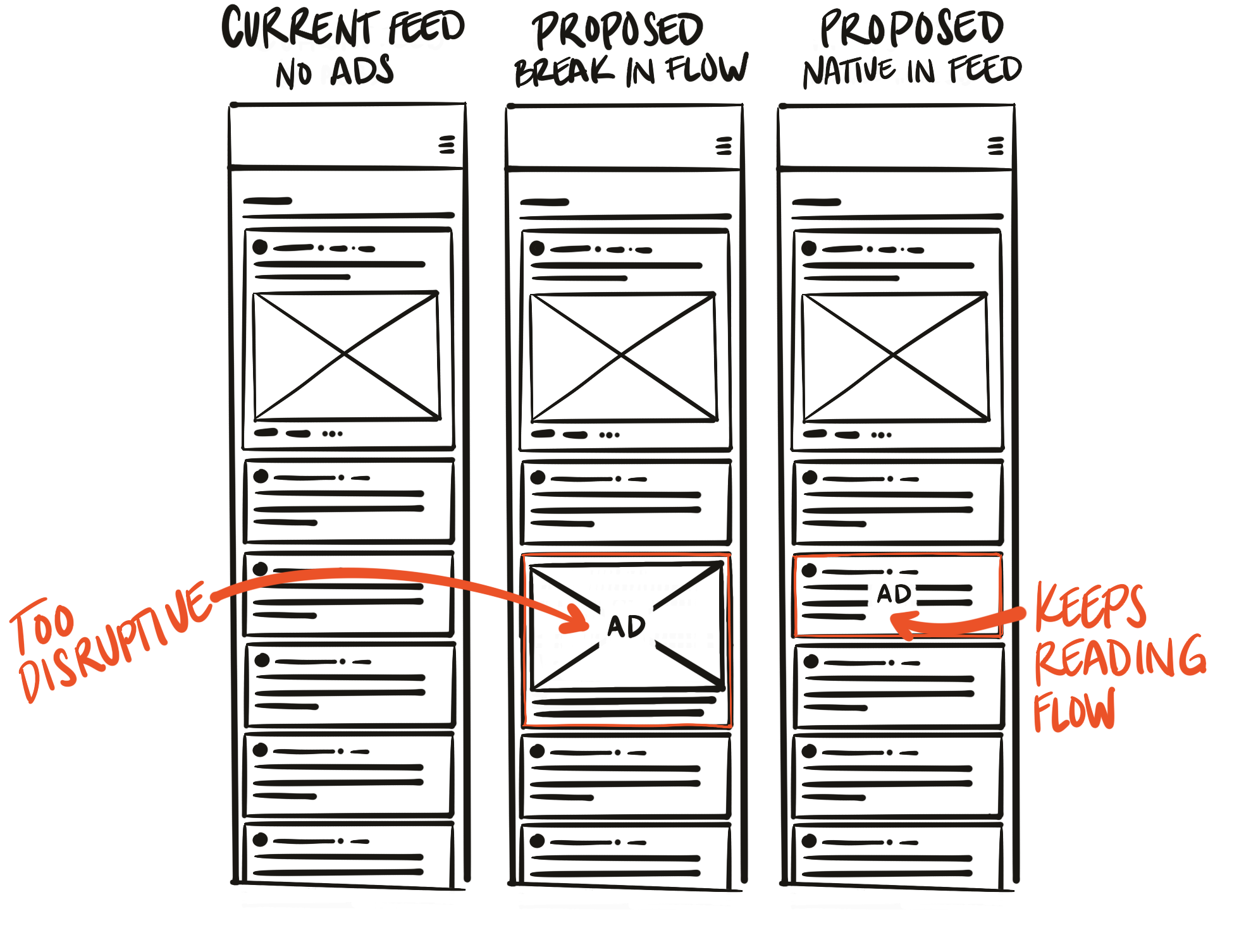
Advertiser visibility vs. reader experience
Product strategy
As a team, we outlined a set of goals to define the success of the product:
Business
Expand monetizable inventory into community pages
Create a turnkey product that Sales could package across advertisers
User Experience
Preserve the reading flow within community discussions
Maintain community participation and page views after launch
Make advertising feel integrated rather than disruptive
Engineering
Scale across nearly 200 community sites; desktop and mobile responsive
Expand platform without increasing long-term maintenance complexity by using reusable components
Operations
Reduce campaign management through standardized placements and limited creative asset requirements
Minimize additional work for Campaign Managers and Engineering
Support both internal campaign tools and future client self-service platform
Design strategy
Advertising should become part of the reading experience, not compete with it
Before starting the design process, I translated the product strategy into design principles to inform every decision:
Preserve the reading flow
Readers should be able to continue scanning the feed without feeling pulled into a competing visual experience. Ads would earn attention through relevance and placement rather than disruption.
Inherit the styling
Native placements adopted the visual language of the surrounding feed by reusing existing layouts, typography, spacing, image treatments, and content hierarchy. The goal was to make the product feel like it belonged to the platform instead of introducing a competing design system.
Standardize required assets
Every placement followed a consistent set of rules rather than allowing campaign-by-campaign customization. This protected the user experience while creating a predictable product that was easier for advertisers to understand, Campaign Managers to execute, and Engineering to maintain.
Design a flexible system
The product needed to work across nearly 200 communities, multiple placements, responsive layouts, internal campaign tools, future self-service platform, and advertisers with different content. Designing with established components would produce a scalable product that could be expanded in the future to additional placements or a migration to a different content management system (CMS).
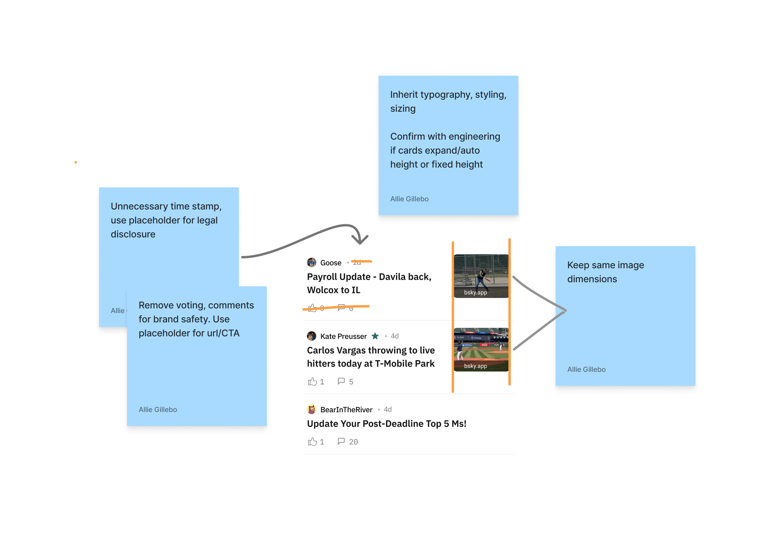
SB Nation design audit
Design Research, Decisions & Tradeoffs
Native integration vs. visual prominence
Question
How native could the ads become without confusing readers or reducing their value for advertisers?
Research
I started with a product audit of the existing community experience, documenting recurring components, card layouts, spacing, typography, hierarchy, and image treatments. The goal was to understand the visual patterns readers had already learned so I could extend them rather than introduce new ones.
I also completed a competitive analysis of Reddit and LinkedIn to understand how other community platforms integrated native advertising and evaluated for where the experience felt natural and where advertising became too visually disruptive.
Decision
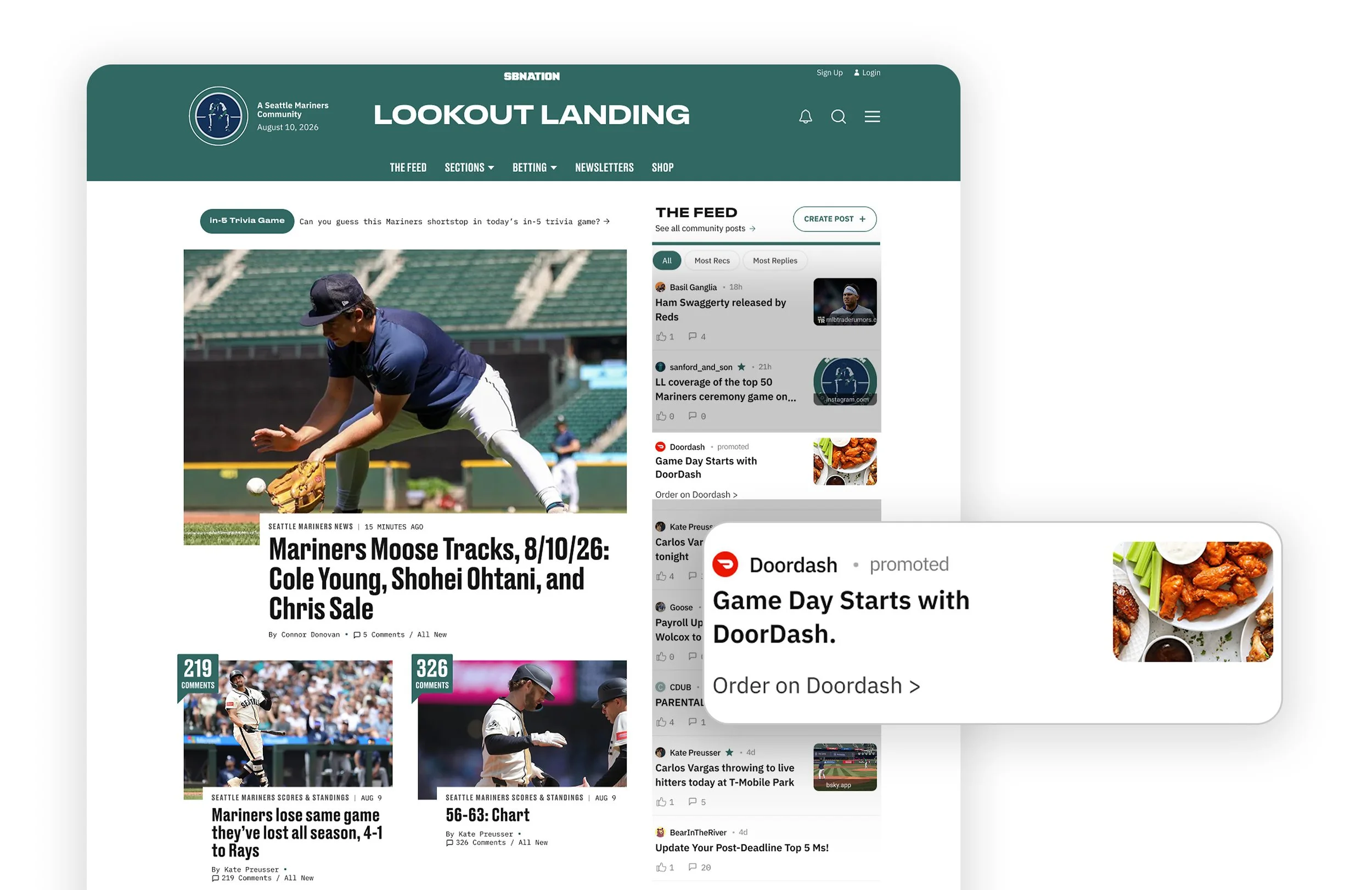
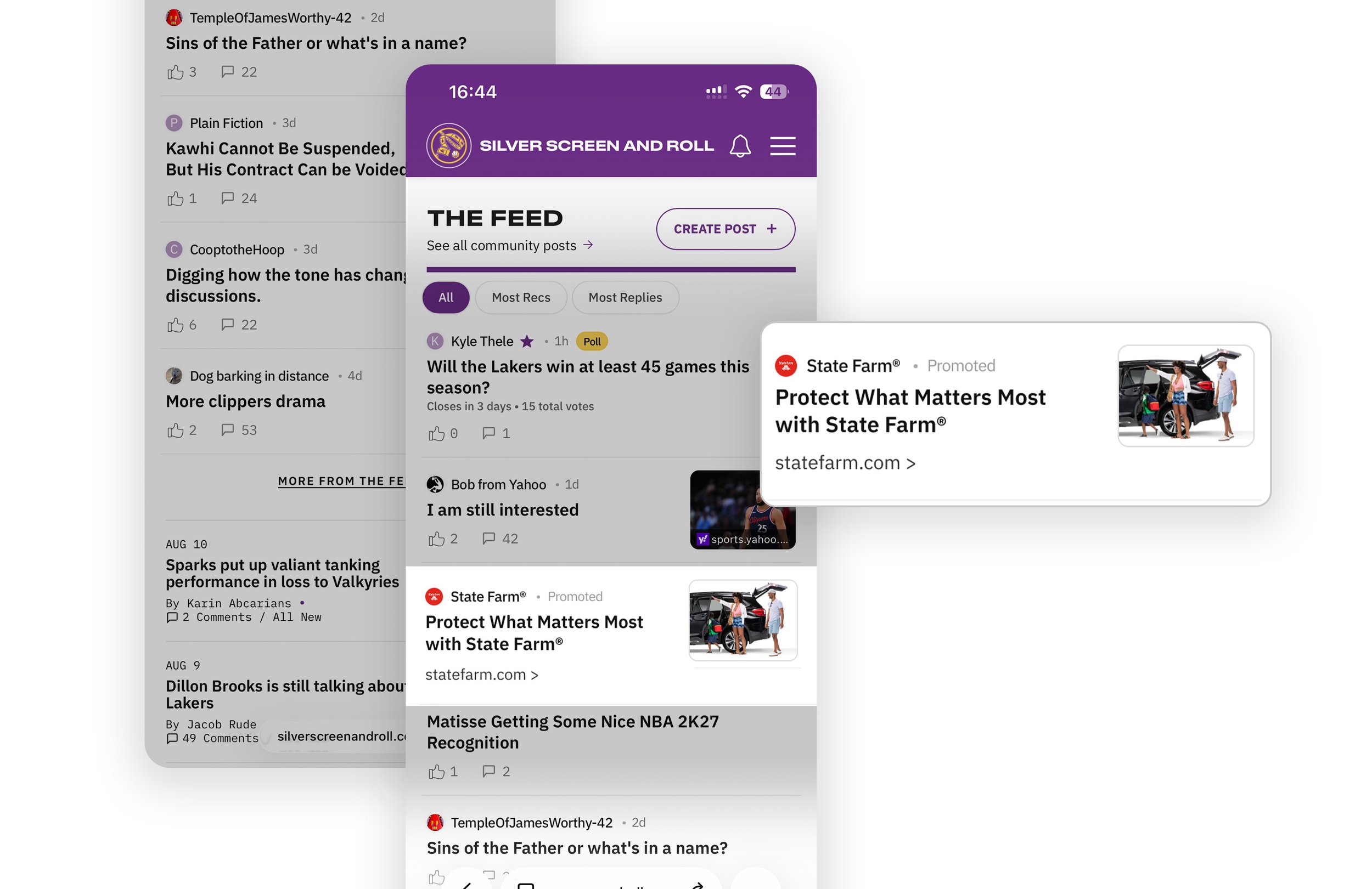
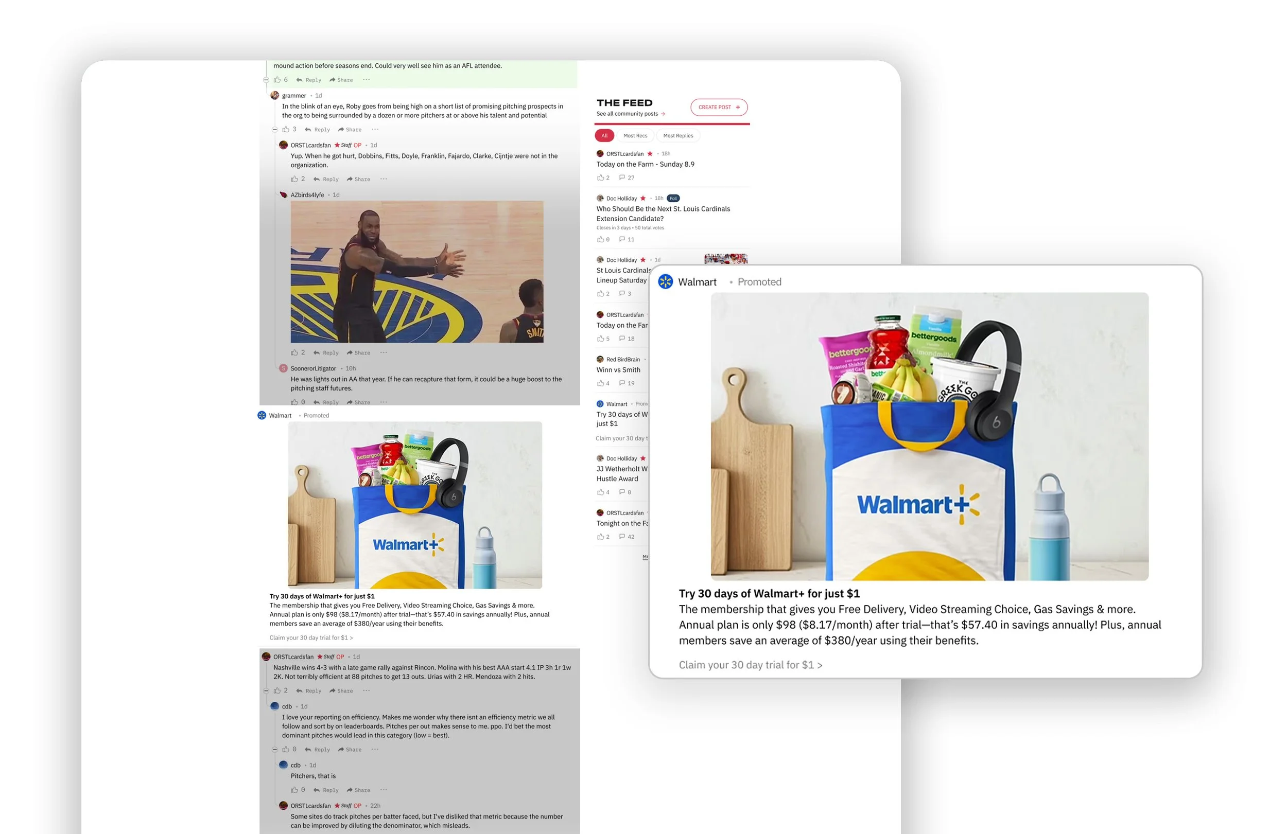
I designed the ads to inherit the visual language of the surrounding feed. Typography, spacing, layouts, image treatments, and hierarchy matched the existing community cards so advertisements remained part of the reading experience while still being clearly identified as promoted content.
Tradeoff
More native ads attract less immediate attention than visually dominant display advertising; this would not meet the disruptive display goal of some advertising clients.
Why this approach
SB Nation already offered display advertising for campaigns whose goal was maximum visual prominence and this product served a complimentary purpose. By reducing visual disruption, advertisers could achieve more frequent exposure without competing against the conversations readers came to participate in.
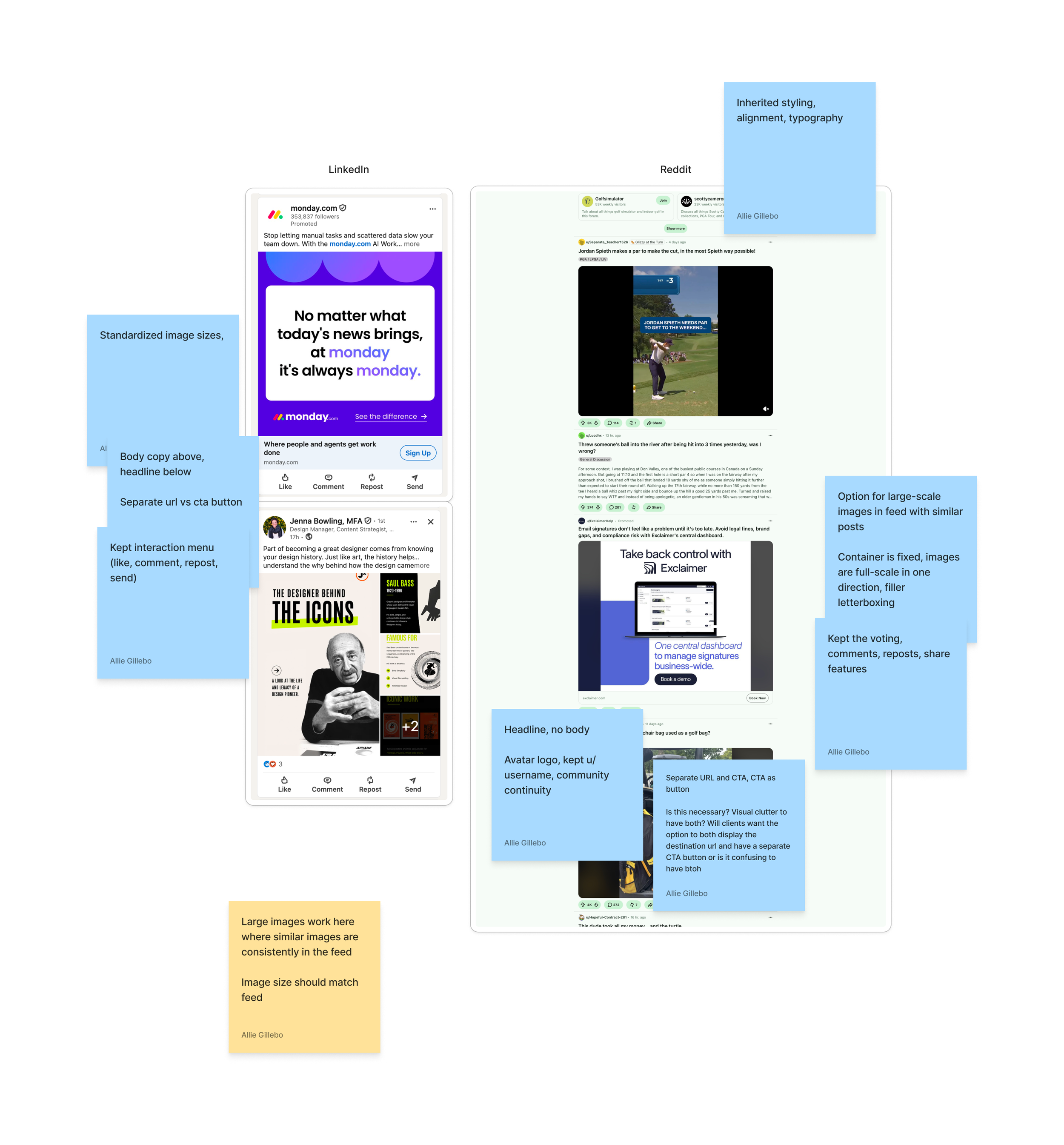
Competitive analysis Reddit, LinkedIn
Low-touch campaign setup
Question
How could we create a product that was simple to launch and easy to manage?
Research
I interviewed Sales to understand advertiser expectations and Campaign Management to understand where campaign launches became slow or difficult. Those conversations made it clear that every additional asset, configuration, or creative option increased the time and effort required to launch a campaign.
I also met with Engineering early to understand the capabilities already available within our advertising platform rather than assuming new functionality would need to be built. Those conversations uncovered an existing image focal-point tool that intelligently cropped a single image across multiple placements.
Decision
I reduced campaigns to the minimum number of required assets and standardized the creative specifications. Advertisers supplied one image, one headline, one body copy, and one destination URL that could scale across the entire placement suite.
I also established shared rules for layouts, character counts, branding, and image treatment so every campaign followed the same predictable structure.
Tradeoff
I removed some visual flexibility in exchange for a much simpler campaign setup.
Why this approach
Every additional asset increased work for advertisers, Sales, Campaign Management, and Engineering while making the future self-service experience more complex. Standardizing the product reduced operational overhead, made campaign requirements easier to communicate, and created a scalable system that could support future growth without increasing implementation effort. Additionally, including some technical features like the smart cropping functionality helped create additional creative control.
Mockups exploring how the same assets work across each placement
Engagement vs. monetization
Question
Where should advertising appear without reducing the value of the community experience?
Research
I partnered with our data team to review page views, scroll depth, click maps, and engagement patterns to understand where readers spent the most time. I also interviewed editors to understand what made their communities successful and what aspects of the experience they felt were most important to protect.
Decision
Partnering with the engineering lead, we determined placements within the feed where readers naturally spent the most time and the frequency of placements that would flow within the reading experience rather than interrupt it.
Tradeoff
Introducing advertising into the platform's highest-engagement surfaces carried the greatest risk of disrupting the very behavior that leadership wanted to monetize.
Why this approach
While Editorial preferred fewer placements and advertisers preferred more, striking the balance that was the least disruptive to the reader meant that we could monetize the highest-engagement sections without diminishing the experience that generated the value.
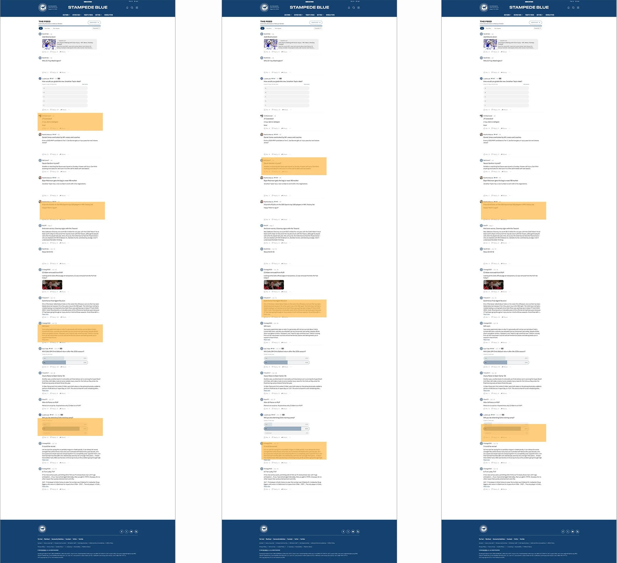
Placement frequency comparisons
Familiarity vs. user expectation
Question
Which elements of community posts should advertisements inherit so that ads look as native as possible?
Research
My product audit identified the UI elements associated with community posts. I evaluated each one based on whether it supported the purpose of an advertisement or would create misleading expectations.
Decision
Advertisements inherited the structure of community cards while removing interactions that no longer made sense, including comments, voting, timestamps.
Tradeoff
Making advertisements too similar to posts or comments risked confusing readers, while changing too much would break the familiarity that made native advertising effective.
Why this approach
Retaining familiar structure reduced disruption, while removing irrelevant interactions created a clearer, more trustworthy experience that aligned with both user expectations and advertiser needs. As well, adding a clear advertising disclosure next to the sponsor name preserved reader trust.
Visual continuity is maintained to preserve natural reading flow
Final product
-
![]()
Desktop Homepage Feed
-
![]()
Mobile Community Feed
-
![]()
Desktop Post Comments
Outcome
300% increase in monetizable inventory
Increase in revenue opportunity with new inventory on 6 page types across all 200+ SB Nation communities
Increased average campaign value
11% average incremental revenue when community inventory was added to existing campaigns (average incremental value, measured Dec 2025-June 2026)
Zero Marginal Cost
Enabled larger campaign buys and scalable revenue growth with no ongoing incremental design or engineering effort
Maintained engagement
User engagement remained stable following launch, indicating that the ads integrated naturally into existing reading behavior without measurable disruption to the community experience
Reflection
Look for opportunities in features that already exist
This project changed how I think about product strategy. It's easy to assume growth comes from launching something entirely new, but in this case the opportunity already existed. The platform had an engaged audience and I learned to recognize untapped commercial value and design products that unlock it.
Engagement is an asset to protect
Working closely with the editorial team showed me how to care for user engagement. They had spent years earning their communities' trust and I saw how easily a product can either reinforce that relationship or chip away at it. Since then, I've approached monetization and platform expansion as something that should build on user trust instead of competing with it.