Selected Product Work
Vox Media & NY Magazine Content Distribution Tool
Content recirculation to keep readers engaged
Flexible content distribution tool that increased article impressions and reduced paid distribution costs across Vox Media's publishing network.
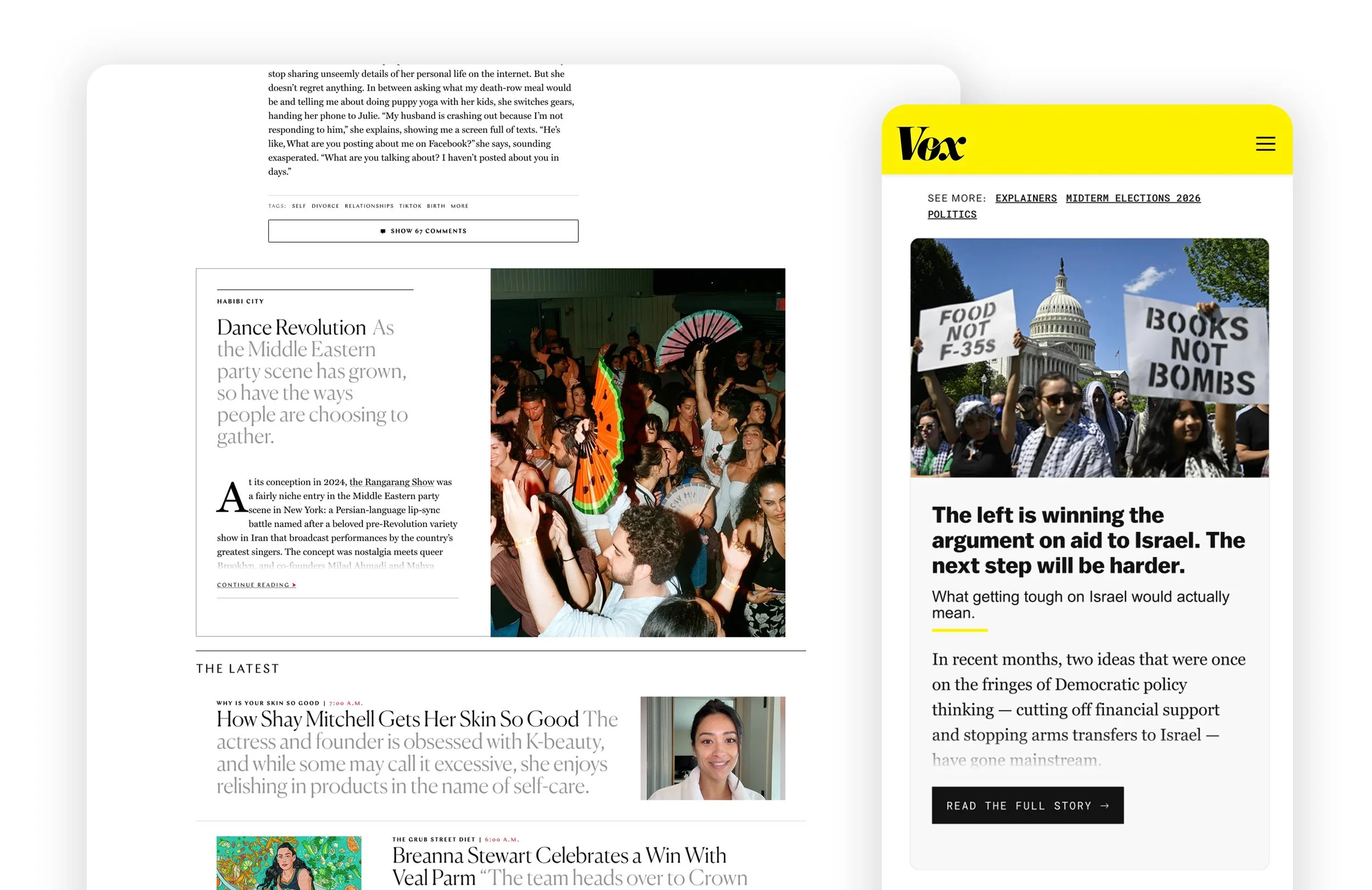
At a glance
I led the design of an internal article recirculation tool to replace a licensed third-party platform used to distribute sponsored content across Vox Media's publishing network.
The brief was simply to replace the existing tool. There was no established design direction or defined experience. I was responsible for determining how the product should work, what content it needed to display, and how the experience could adapt across 17 editorial brands.
The resulting tool presented live article previews at the bottom of articles, encouraging readers to continue to another story while adapting to each publication's visual identity.
Outcome: Contributed to a projected 6% reduction in annual distribution costs and exceeded early savings projections by 17% during the first three months after launch (Based on internal rollout projections and measured savings).
Role
Lead Product Designer throughout discovery, design, implementation, and launch
Responsibilities
Product strategy • UX/UI design • User testing • Systems design • Prototyping • Implementation
Team
1 Product Manager • 1 Product Director • 1 Engineer • 1 Product Designer (me)
Partners
Advertising Operations • Editoria • QA
Timeline
Aug - Nov 2024
Business Opportunity
Turn operational cost into owned capability
Sponsored content campaigns relied on a licensed third-party platform to recirculate readers to targeted articles and help meet distribution goals. Leadership wanted to replace it with an internally-owned solution to reduce ongoing licensing costs.
The request established what the business needed to accomplish, but left the product itself undefined. There was no prescribed layout, content hierarchy, or interaction model. I had to determine what an article preview should contain, how it should be presented, and how it could work across different publications and devices.
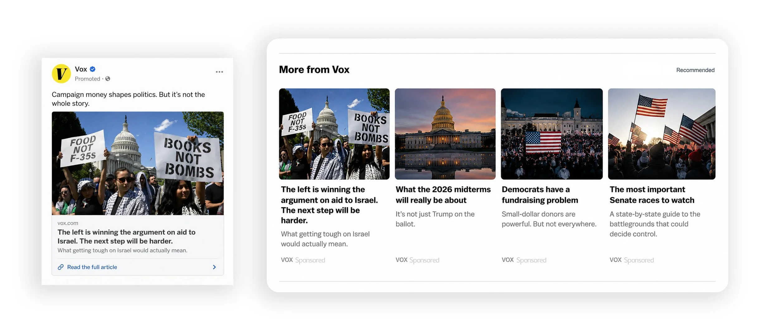
The Challenge
The central design question I had to answer was:
How to introduce the new article in a way that gives readers a compelling reason to continue, while preserving the reading experience and adapting to the needs of 17 editorial brands?
The tool needed to give readers a compelling reason to open another article while fitting naturally into the story they were already reading. At the same time, it had to support publications with different editorial styles, content structures, and technical environments.
The design needed to balance three requirements:
Reader experience: Present enough of the next story to create interest without overwhelming the current article or making the module feel like an advertisement.
Editorial identity: Adapt to different typography, layouts, imagery, and content conventions across Vox Media and New York Magazine properties.
Platform scalability: Render live CMS content across desktop and mobile while keeping the implementation reusable and maintainable.
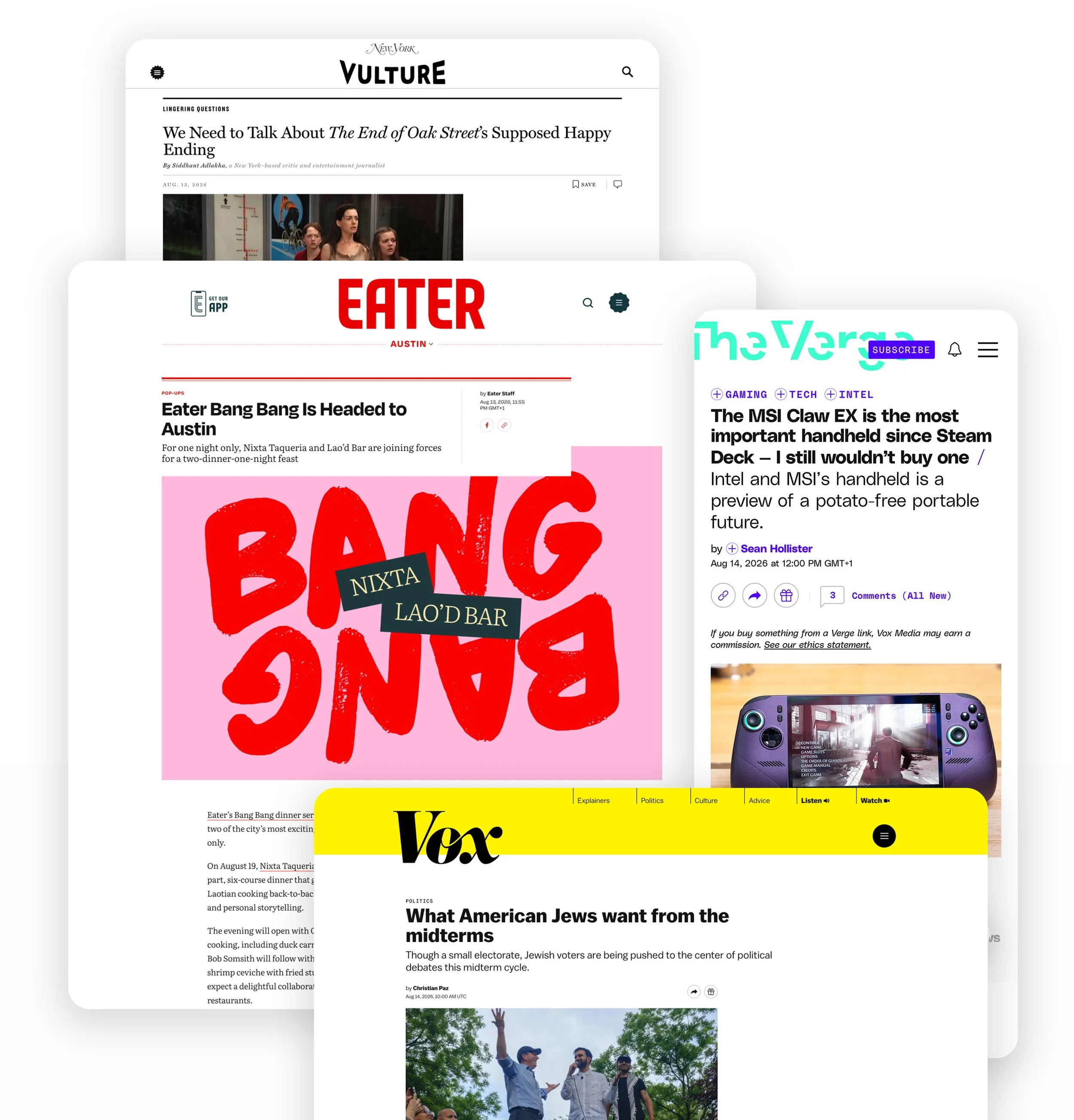
Product strategy
I approached this as a product definition problem. Before committing to a visual direction, I needed to understand the content being presented, the reader journey, the existing editorial conventions, and the technical constraints of the platform.
Business
Reduce reliance on a licensed third-party tool.
Support sponsored-content distribution goals.
Create a reusable capability that could serve multiple publications.
User Experience
Encourage continued reading through richer article previews.
Preserve the reading experience and avoid unnecessary interruption.
Make the transition to the next article feel natural.
Platform & Enginnering
Render live content from existing CMS.
Support desktop and mobile across multiple brand families.
Give editorial teams control over the experience.
Minimize bespoke implementation and ongoing maintenance.
Design Process
Competitive/Industry research
I examined how other publishers presented related and recommended articles, looking at the use of headlines, subheadlines, imagery, excerpts, and metadata across desktop and mobile.
The goal was to understand established content presentation patterns and identify useful starting points for the design. I used these findings alongside our own editorial content to develop an initial strategy for the visual hierarchy.
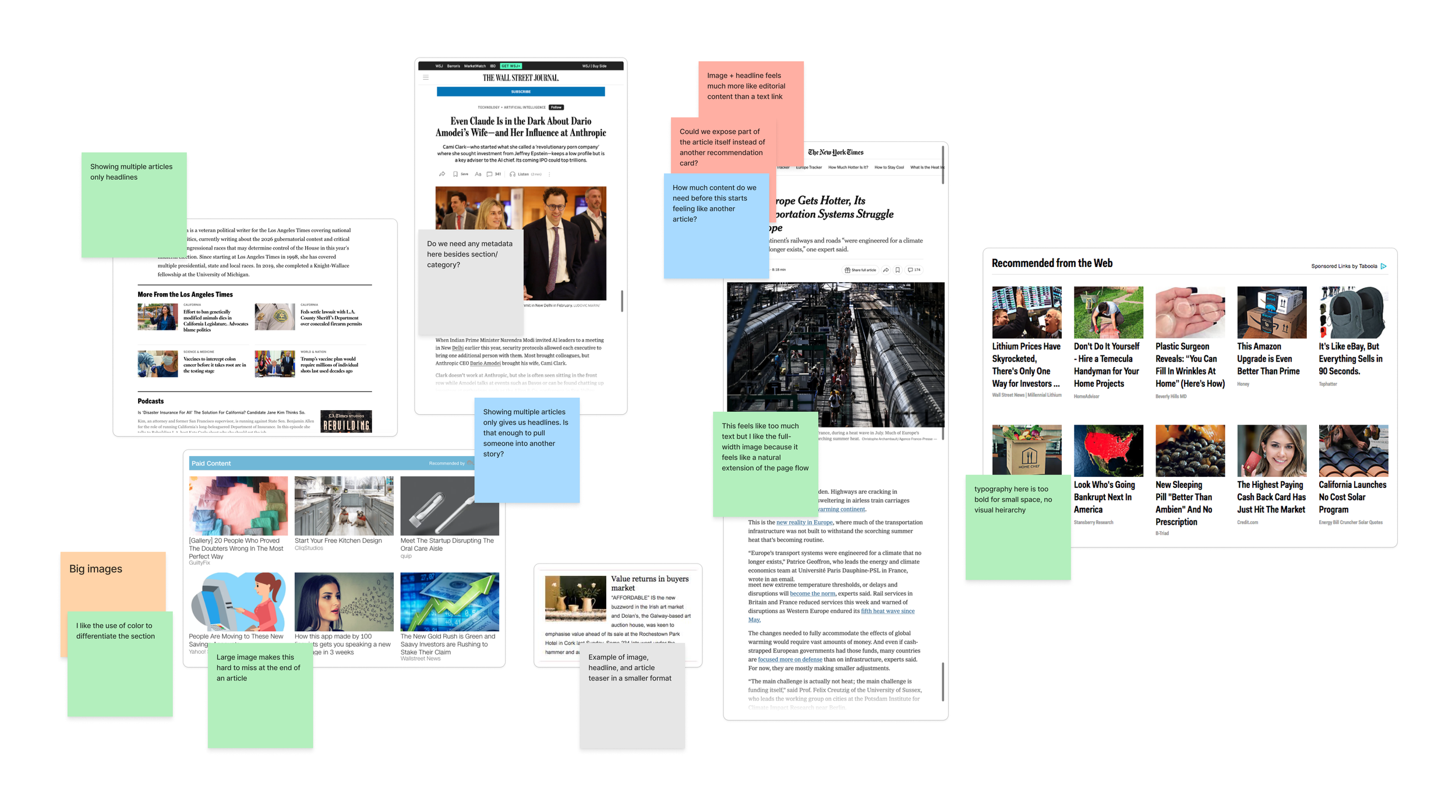
Competitive analysis and exploring different visual treatments
Understanding the reader journey and technical constraints
I mapped the intended journey from finishing one article to discovering and opening the next. Ideally, a reader would encounter the next headline, get enough context to become interested, and transition into the opening paragraph and full article.
I explored how this transition could work within the reading experience, then worked with Engineering to understand what was technically feasible. Infinite scrolling or automatically loading the next article in full was not supported by the existing platform capabilities. This established an important constraint: the preview needed to work as a contained module at the bottom of the current article.
That decision shaped the product direction. The preview needed to communicate the next story effectively within a limited amount of space, with a clear path into the full article.
Establishing the content hierarchy
I translated the research and journey mapping into an initial hierarchy for the preview:
Headline: The primary point of entry. It needed to appear in full because truncating the headline could undermine its meaning and editorial intent.
Subheadline: An important supporting element that provides context and helps establish the topic and tone of the story.
Opening paragraph: An opportunity to draw readers further into the article. The amount of text to show was still an open design question.
Image: A visual cue to help communicate the story and attract attention, with dimensions and prominence that needed to work across different content and screen sizes.
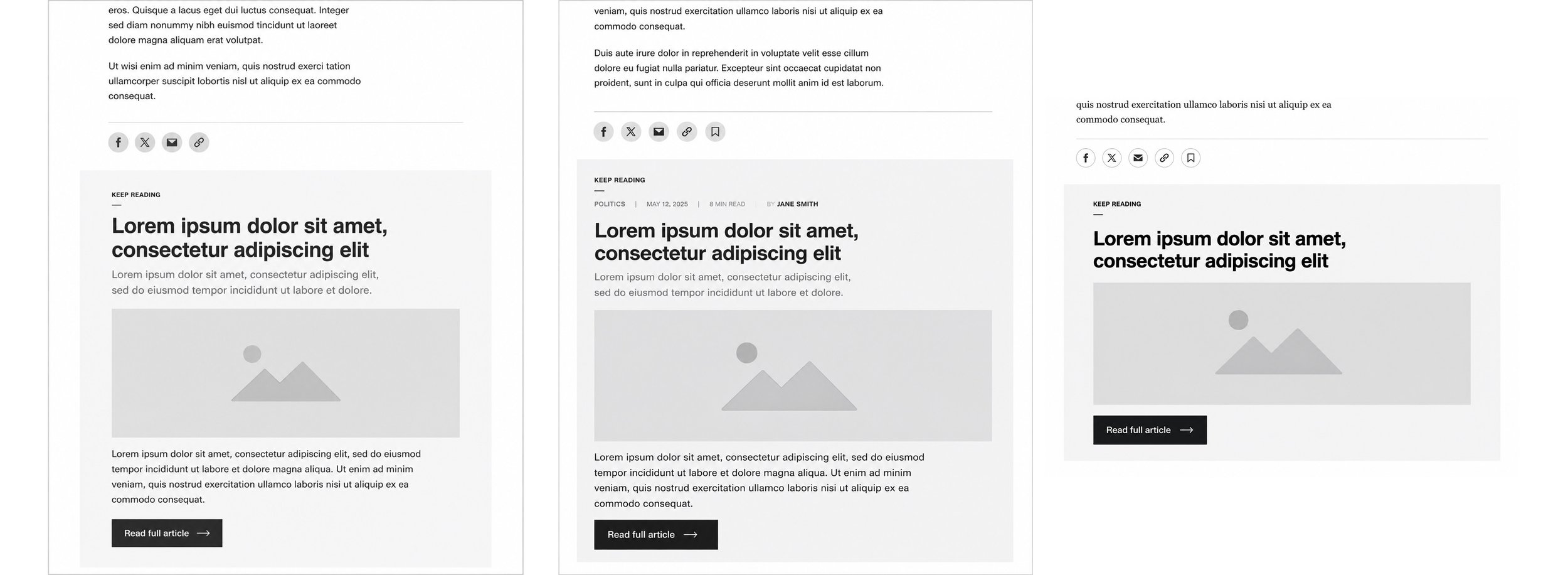
Lo-fi mocks for stakeholder consideration
Establishing the design direction through research
With no existing design direction to build from, I began by developing an understanding of how articles were presented across the publishing network and what information readers needed to decide whether to continue reading.
Key Decisions & Tradeoffs
Decision 1: Determining the right content hierarchy and preview length
The question
How much of the next article should readers see to understand the story and feel compelled to continue reading?
Establishing the design hypotheses
The reader journey informed my initial content hierarchy. The headline and subheadline were the primary entry points, providing the topic and tone of the next story. I determined these should always appear in full, since truncating either could compromise the meaning or editorial intent.
The opening paragraph presented a more nuanced question. Showing the entire paragraph would provide additional context, but a shorter excerpt could create a stronger reason to continue. I wanted to explore whether ending the preview mid-thought could use the natural curiosity of an unfinished passage to encourage readers to click through.
I developed five design variations exploring different combinations of headline, subheadline, excerpt length, and image layout.
Validating the experience with readers
I conducted a user interview usability study to compare the effectiveness of each design and look for themes in which design patterns best achieved the engaement goal. Participants were shown randomized selections of the variations and asked qualitative questions to understand:
Whether they could understand what article was being presented.
Whether the preview provided enough context to make the content interesting.
Whether the hierarchy was clear and easy to navigate.
Which design they preferred and why.
This gave me a way to evaluate the different approaches through reader interpretation and preference, rather than relying on my own assumptions about content density and visual hierarchy.
The outcome
I used the findings to establish a preliminary design direction for the preview, including its content hierarchy, text treatment, and image presentation. This gave the team a more informed basis for moving into detailed design and stakeholder review.
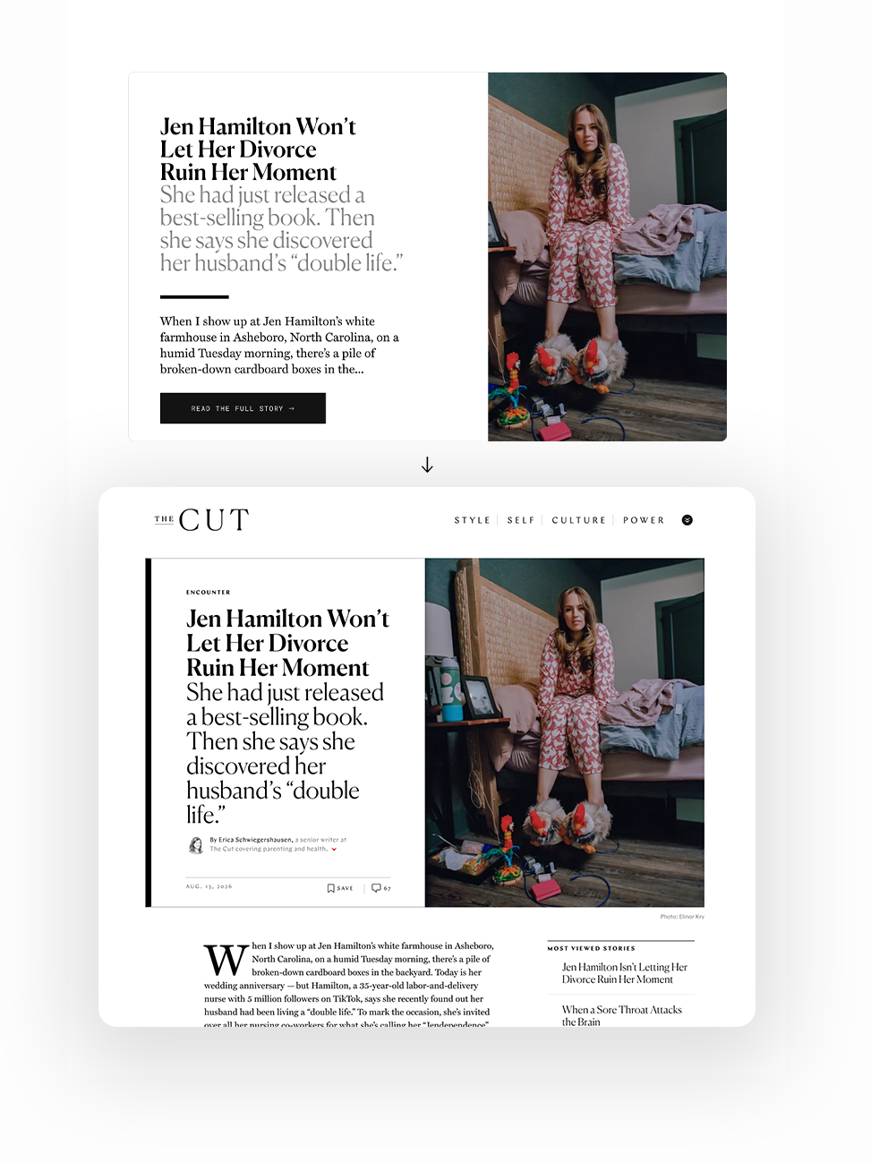
Template consistency worked across Vox Media brands (above), but didn’t preserve New York Magazine’s distinct identity (below).
Decision 2: Balancing competing stakeholder opinions
The question
How could one product serve different editorial brands while preserving the visual identity and publishing conventions of each?
The challenge
After validating the initial design direction, I presented how the preview would render New York Magazine content to its editorial team. Their feedback revealed that the proposed layout did not align with their established editorial style. The shared template that I had designed worked across Vox Media's legacy brands, but its presentation felt too different from the conventions used by New York Magazine.
This introduced a new requirement. The product needed to support a consistent underlying experience while accommodating the distinct expectations of two editorial organizations with shared ownership of the outcome.
Evaluating the options
I considered how to address the feedback while keeping the product maintainable. One option was to retain a single template and make compromises to its presentation. That would reduce engineering complexity, but risked weakening the editorial identity of New York Magazine. The alternative was to create separate templates for the two brand families, preserving their respective visual conventions while sharing the underlying functionality.
The decision
I chose to develop two reusable templates, one for Vox Media publications and another for New York Magazine properties. Each template could inherit the typography, layouts, spacing, and visual language of its respective brand family, while using the same underlying product functionality.
Trade-off and rationale
Supporting two templates required additional engineering work compared with a single implementation. However, it was important to preserve the editorial credibility and visual integrity of both brand families. A uniform presentation would have made the product simpler to implement, but would have required one editorial organization to compromise its established design conventions.
The two-template approach provided a better balance between brand-specific presentation and a reusable platform architecture. It allowed the product to serve the needs of both editorial teams without creating a bespoke implementation for every publication.
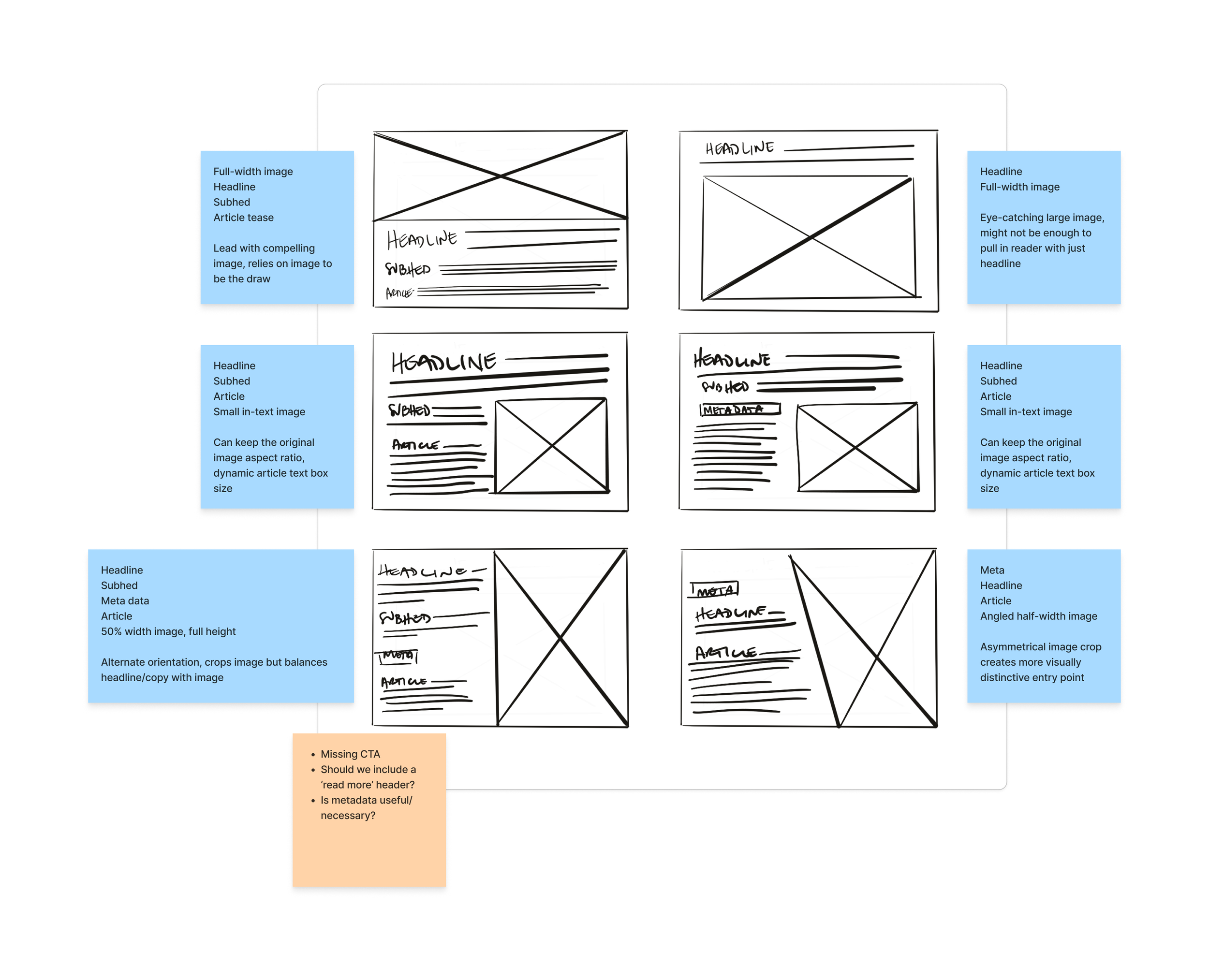
Early exploratory wireframes considering hierarchy, necessary elements, visual balance
Final Product
A flexible tool built for readers and publishers
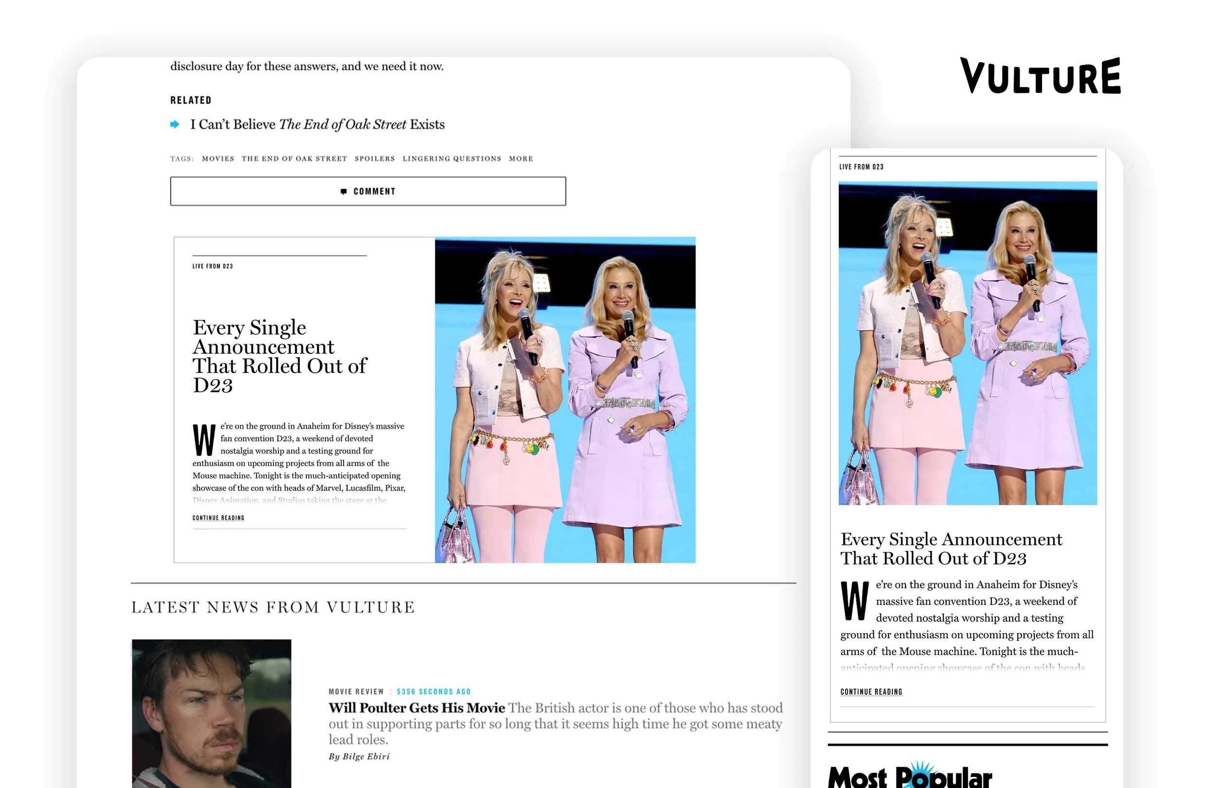
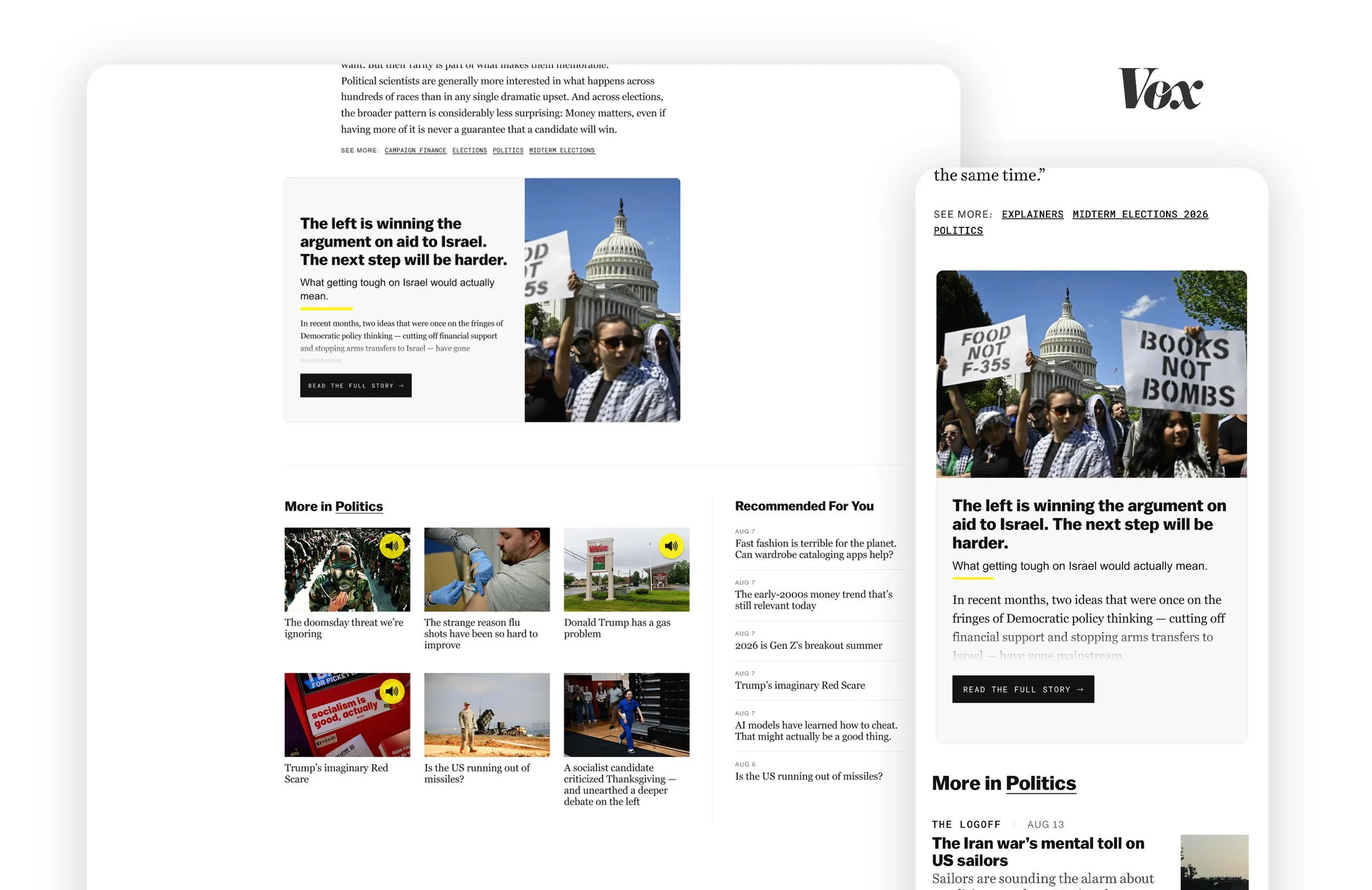
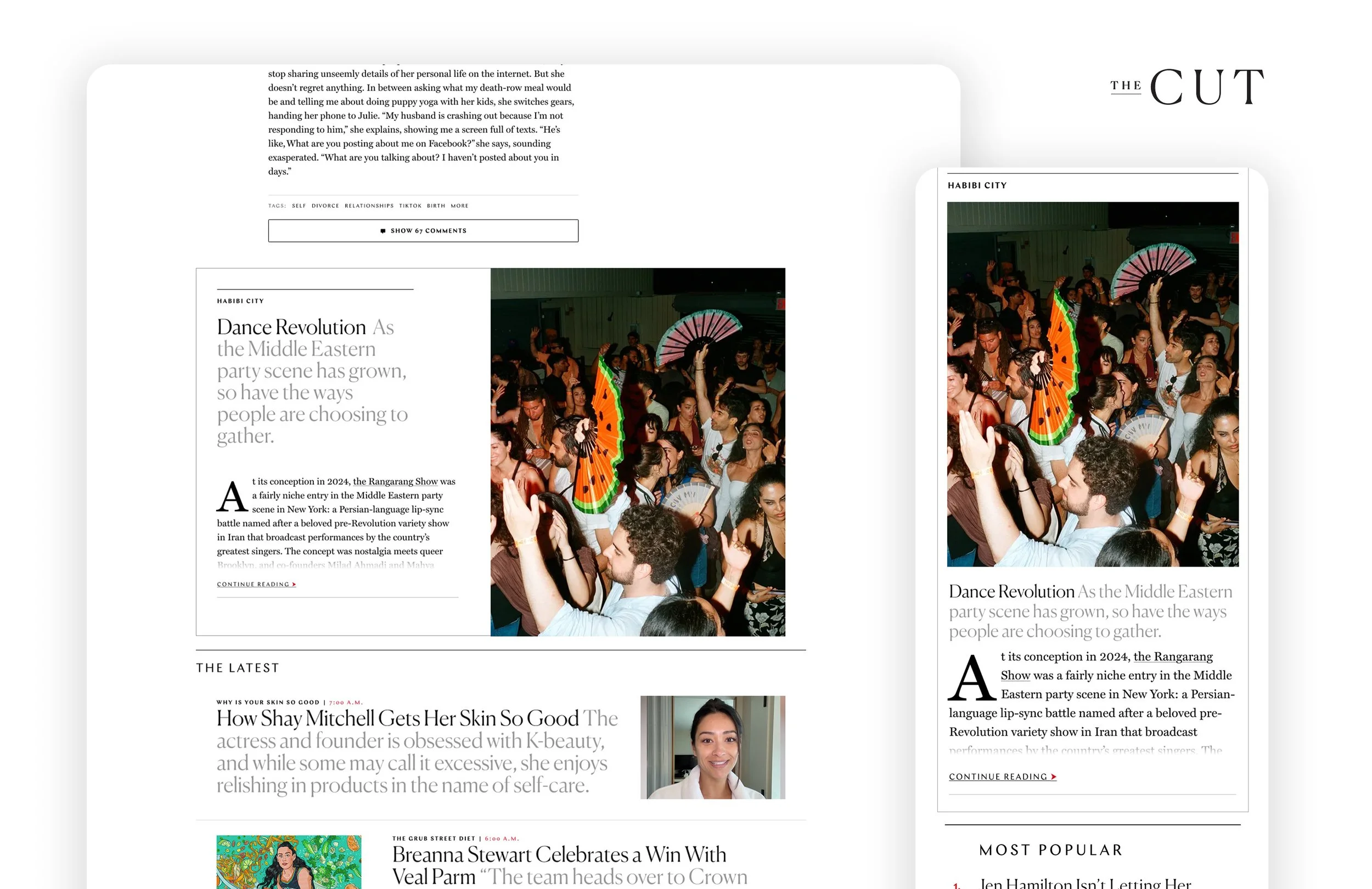
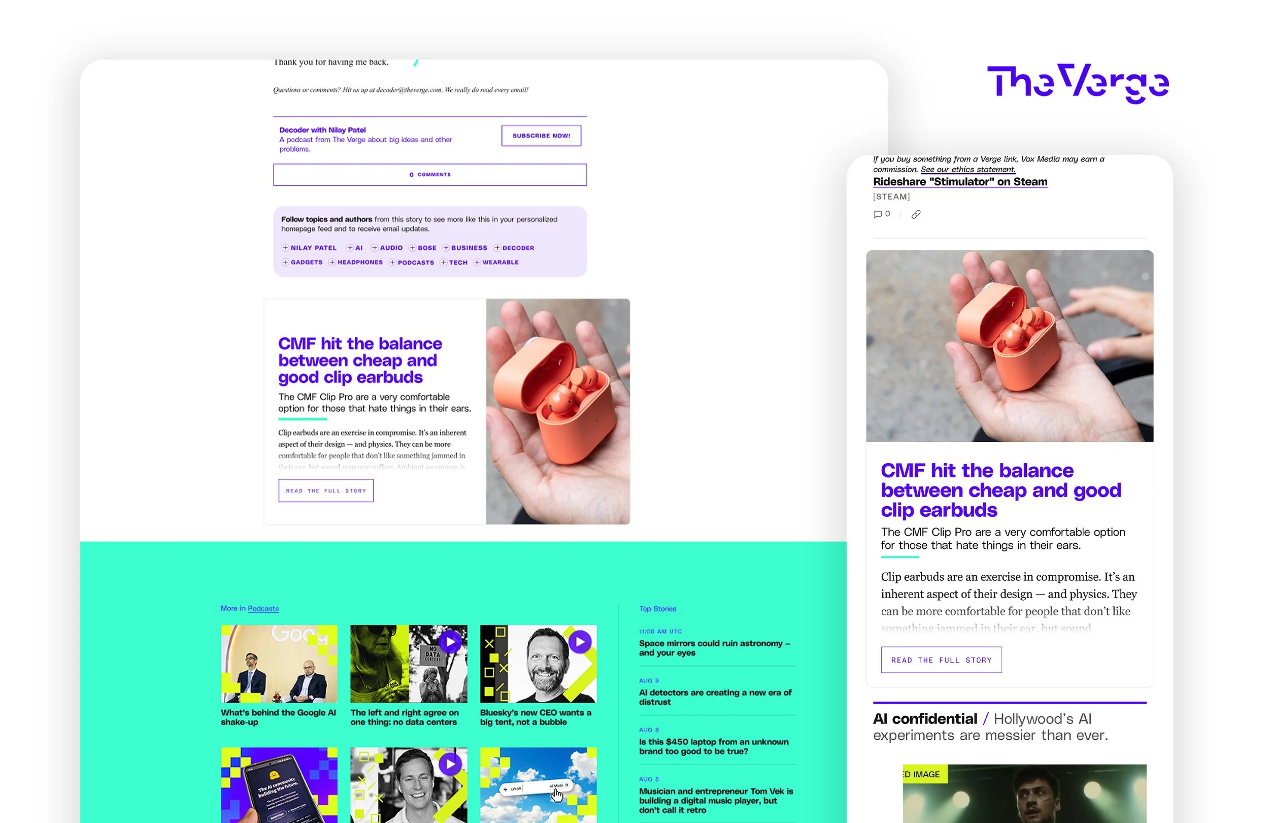
The final product replaced the licensed third-party tool with an internal experience that rendered live article content from the CMS. Rather than presenting readers with headline-only recommendations, it introduced richer previews designed to encourage continued reading.
The tool adapted to desktop and mobile while inheriting the typography, layouts, and visual conventions of each publication. Two reusable templates supported Vox Media and New York Magazine brand families, with shared functionality across three CMSs.
The result was a maintainable internal capability that supported article recirculation across 17 editorial brands while giving the business greater control over the reader experience and ongoing distribution costs.
-
![]()
NY Magazine | Vulture
-
![]()
Vox Media | Vox
-
![]()
NY Magazine | The Cut
-
![]()
Vox Media | The Verge
Outcome
Reduced annual distribution costs
Reduce annual distribution costs by 6% by replacing a licensed third-party article recirculation tool. (Based on internal reported savings)
Exceeded early projections
The tool generated 17% more savings than projected during its first three months after launch, validating the decision to replace the third-party solution with an o&o product.
Scaled across multiple platforms
Built a single tool that served two brand families and adapted across three CMSs.
Reflection
Aligning stakeholders earlier in the design process
From this project I experienced the importance of identifying and involving all decision-making stakeholders early in the design process. I had progressed substantially through the initial design direction before presenting it to the New York Magazine editorial team. Their feedback surfaced important brand requirements that changed the direction of the solution and required additional design and engineering work.
Involving those stakeholders earlier would have helped establish the requirements and potential constraints before committing to a design direction. It reinforced the importance of understanding who has ownership of the experience, whose needs the product must serve, and who needs to be involved in validating the direction.
Designing for systems, not just individual experiences
Supporting 17 editorial brands reinforced the importance of accounting for variation when designing platform-level products. A solution that works well in one context may not translate directly to another, particularly when editorial conventions and technical environments differ. The two-template approach allowed us to preserve distinct brand identities while maintaining shared functionality. It gave me a practical example of how to balance consistency, flexibility, and maintainability when designing products for complex publishing ecosystems.