Selected Product Work
Vox Media & NY Magazine Content Distribution Tool
Content recirculation to keep readers engaged
Flexible content distribution tool that increased article impressions and reduced paid distribution costs across Vox Media's publishing network.
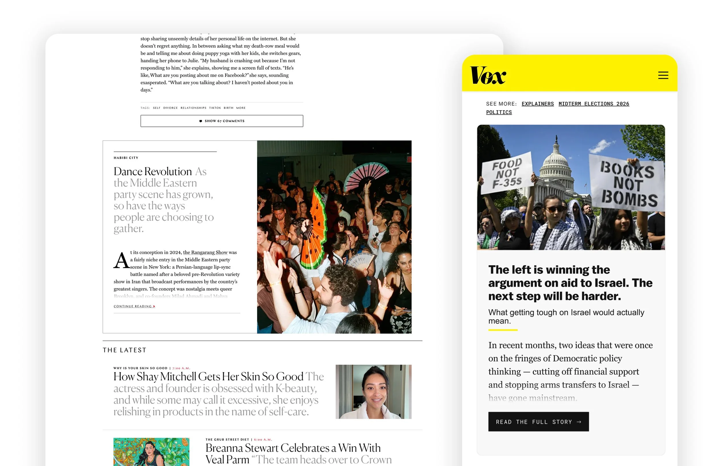
At a glance
Vox Media relied on a third-party article recirculation tool to drive readers to sponsored content and meet campaign distribution goals. Leadership identified an opportunity to bring that capability in-house, reducing operational overhead while giving the business greater control over the reader experience.
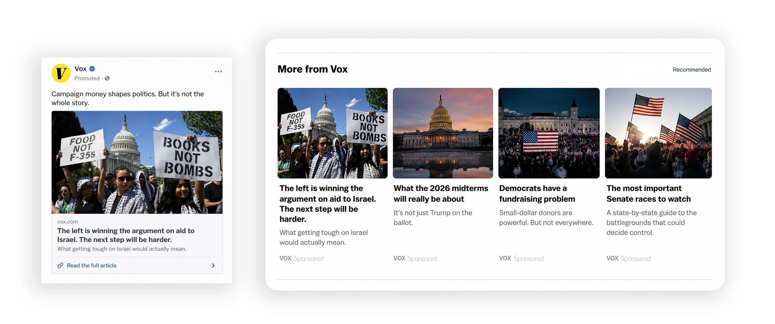
I led the end-to-end design of a reusable article recirculation tool that rendered live article previews across multiple publishing brands. The tool preserved each publication's editorial identity while encouraging readers to naturally continue into another article.
Outcome: Contributed to a projected 6% reduction in annual distribution costs and exceeded early savings projections by 17% during the first three months after launch (Based on internal rollout projections and measured savings).
Role
Lead Product Designer throughout discovery, design, implementation, and launch
Timeline
Aug - Nov 2024
Team
1 Product Manager • 1 Product Director • 1 Engineer • 1 Product Designer (me)
Partners
Advertising Operations • Editorial • QA
Responsibilities
Product design • Systems design • Prototyping
Business Opportunity
Turn operational cost into owned capability
Sponsored content depended on a licensed third-party tool to recirculate readers to targeted articles and help campaigns meet distribution goals. While effective in helping generate revenue, it also increased operational overhead. Leadership identified the opportunity to bring that capability in-house by replacing the third-party solution with an o&o article recirculation tool.
The Challenge
Increase article recirculation without interrupting the reading experience.
The tool had to encourage readers to continue into another article without feeling like an advertisement or interrupting the experience they came for. At the same time, it needed to work across multiple publishing brands with very different visual identities. The solution had to adapt to different typography, layouts, content types, and responsive breakpoints while remaining one reusable tool that Engineering could maintain.
The solution needed to balance three priorities:
Business
Replace a licensed third-party product, reduce operational overhead, and create a reusable tool that could support future distribution needs.
User Experience
Keep readers engaged by making the next article feel like a natural continuation instead of a recommendation.
Platform
Support multiple brands, desktop and mobile, and live CMS content while preserving each publication's editorial identity.
Product strategy
Business
Replace a licensed third-party tool with an internal solution
Reduce operational overhead
Increase article recirculation across owned properties
Operations
Give editorial teams control over promoted content
Create a reusable tool that could scale across multiple publishing brands
As a team, we defined a clear set of goals before exploring solutions:
User Experience
Help readers naturally discover another article
Preserve the reading experience without introducing unnecessary friction
Make the transition into the next story feel seamless
Engineering
Support live CMS content across desktop and mobile
Adapt to different brand styles without building separate tools for every publication
Design Process
My goal: Design a tool that would draw readers in
I first needed to understand how readers naturally moved from one story to the next and how other publishers approached article recirculation. At the same time, I worked closely with Product, Editorial, and Engineering to understand the technical constraints, editorial expectations, and operational needs that would shape the solution.
In my research and design process I focused on:
Understanding how readers discover their next article
Exploring different ways to present live article content
Designing a flexible tool that could adapt across multiple brands
Refining the experience through editorial and engineering feedback
Understanding reader behavior
How could we make readers want to continue into another article?
I started by studying how major publishers encouraged readers to keep reading. I also reviewed our existing experience and internal data, which showed that article previews consistently drove more recirculation than headline-only links. That established my direction: replace static recommendations with a fuller article preview that felt like the beginning of another story.
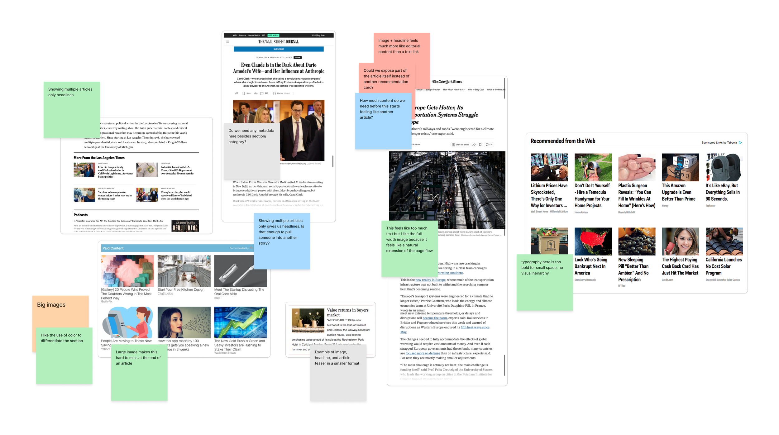
Competitive analysis and exploring different visual treatments
Exploring the reading experience
What information is enough to create curiosity?
I explored different combinations of headlines, imagery, metadata, and article excerpts to find the right balance. The goal was to reveal enough of the next story to encourage another click without overwhelming readers. I also tested how the experience should adapt between desktop and mobile.
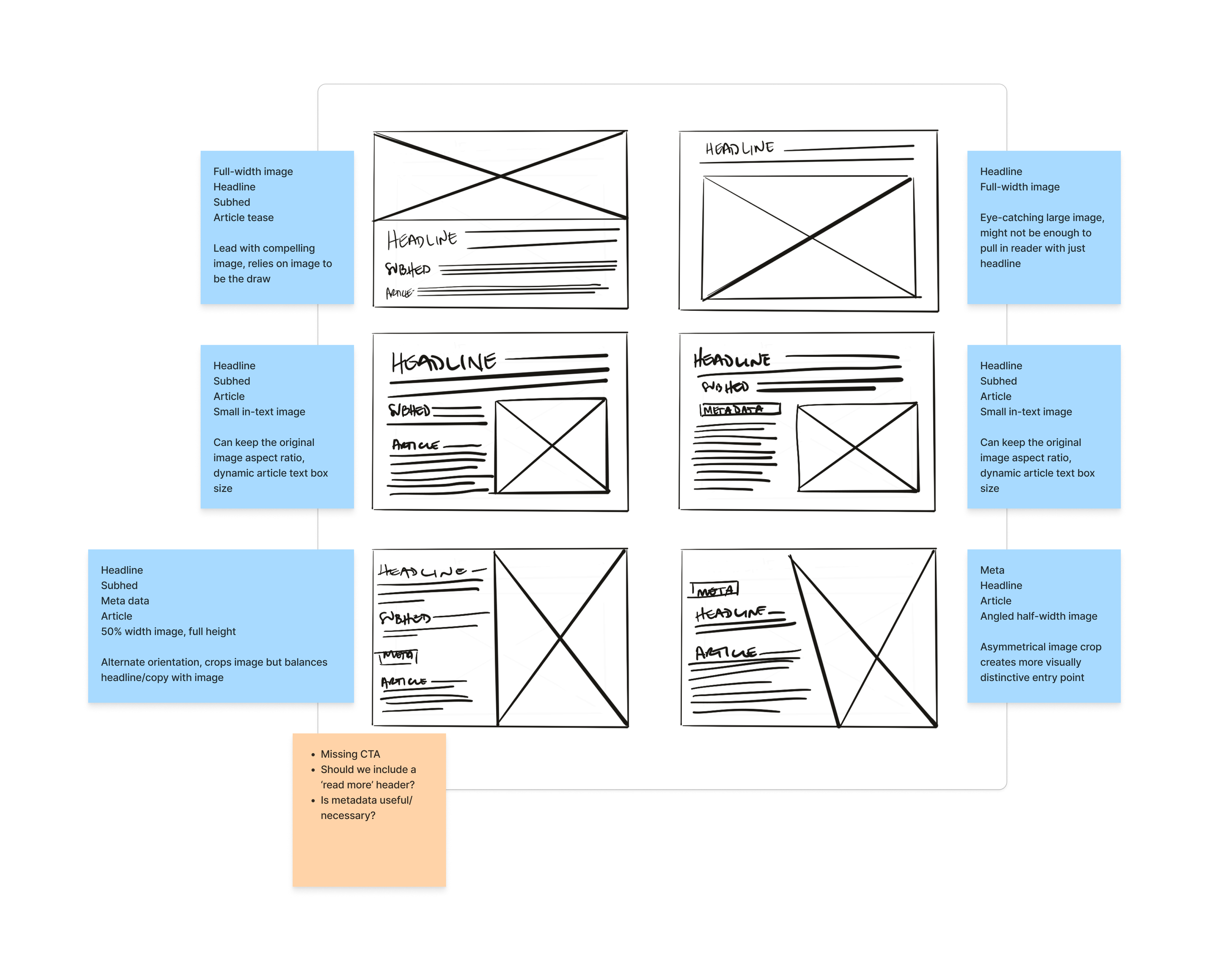
Early exploratory wireframes considering hierarchy, necessary elements, visual balance
Designing for scale
How could one tool work across multiple brands?
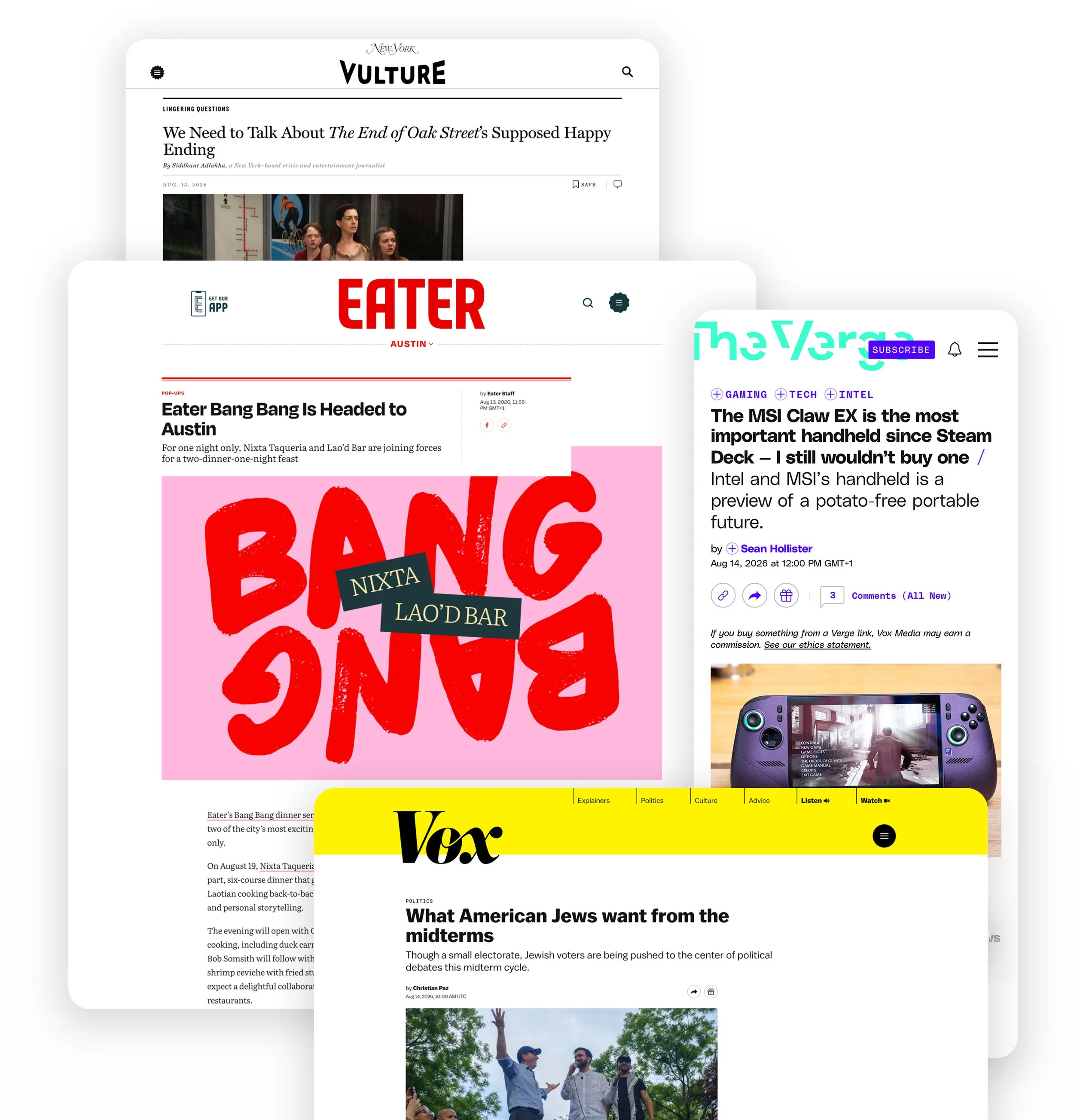
The tool needed to render live content from the CMS while adapting to different typography, layouts, and editorial styles. As the designs evolved, it became clear that a single solution wouldn't preserve the visual identity of every publication. Working with Product, Editorial, and Engineering, we landed on two reusable templates: one for Vox Media publications and one for New York Magazine properties. This preserved each brand's visual identity without creating a bespoke solution for every site.
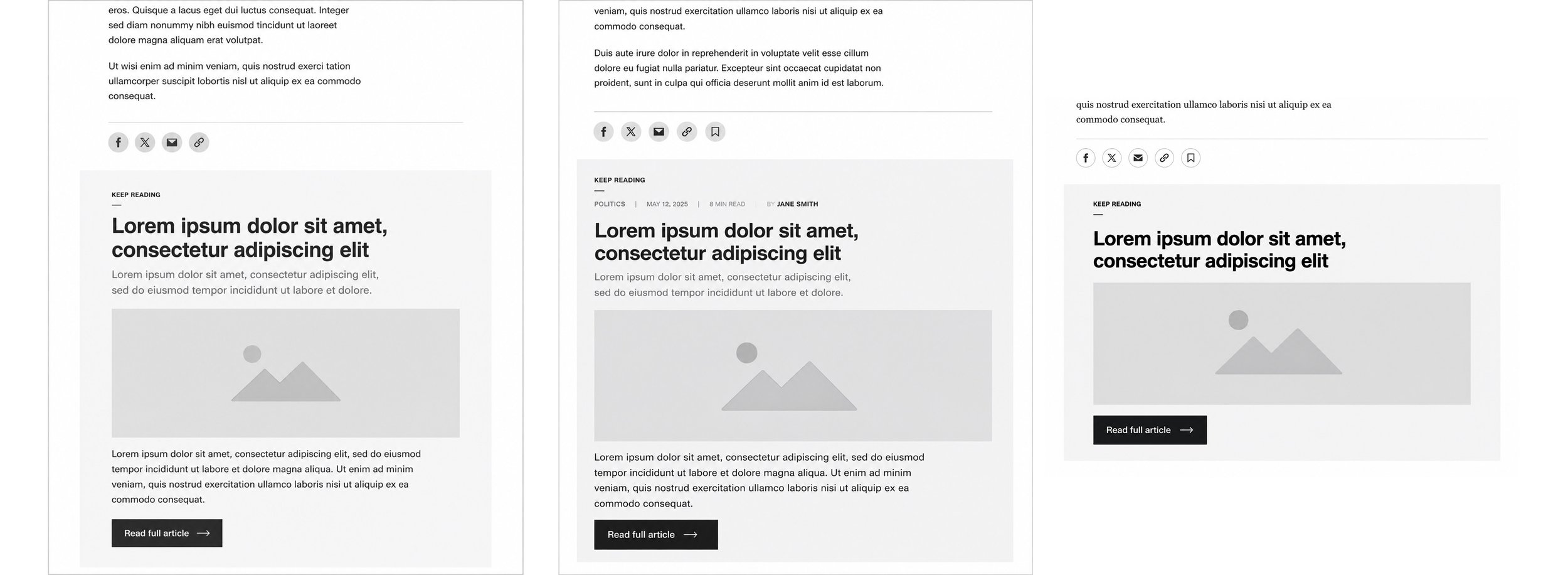
Lo-fi mocks for stakeholder consideration
Collaboration
How to get buy-in from multiple stakeholders?
Because the tool would appear across many publications, I shared concepts early and often with Editorial, Product, Engineering, and leadership. Reviews helped refine everything from teaser length and content hierarchy to responsive behavior and edge cases. Those conversations also uncovered technical opportunities, like reusing existing CMS capabilities, which reduced engineering effort while making the tool scalable.
Key Decision & Tradeoff
Can we built one tool for all without compromising each publication's identity?
Question
How could one article recirculation tool work across multiple publishing brands without feeling out of place?
Research
The tool needed to launch across Vox Media's publishing network, including both legacy Vox brands and New York Magazine properties. Although each publication had its own visual identity, the two groups had evolved independently and followed noticeably different editorial design patterns. I worked closely with Editorial, Product, and Engineering throughout the design process, gathering feedback from each publication to ensure the experience felt native before launch.
Decision
Our original goal was a single design that could scale everywhere. As the work progressed, it became clear that one solution would force unnecessary compromises. Instead, we created two reusable templates: one for Vox Media publications and one for New York Magazine properties. Each template inherited the typography, layouts, spacing, and visual language of its respective brand family while sharing the same underlying functionality.
Tradeoff
Supporting two templates required more engineering work than a single implementation, but significantly less than building bespoke versions for every publication.
Business Impact
Well-designed article previews created a compelling reason to continue reading, increasing article recirculation which supported the broader goal of increasing article impressions while reducing reliance on paid content distribution.
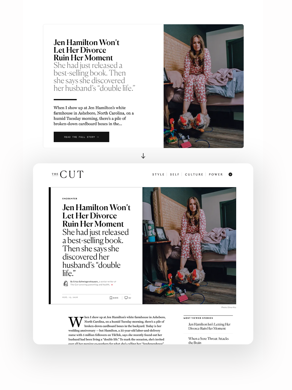
Template consistency worked across Vox Media brands (above), but didn’t preserve New York Magazine’s distinct identity (below).
Final Product
A flexible tool built for readers and publishers
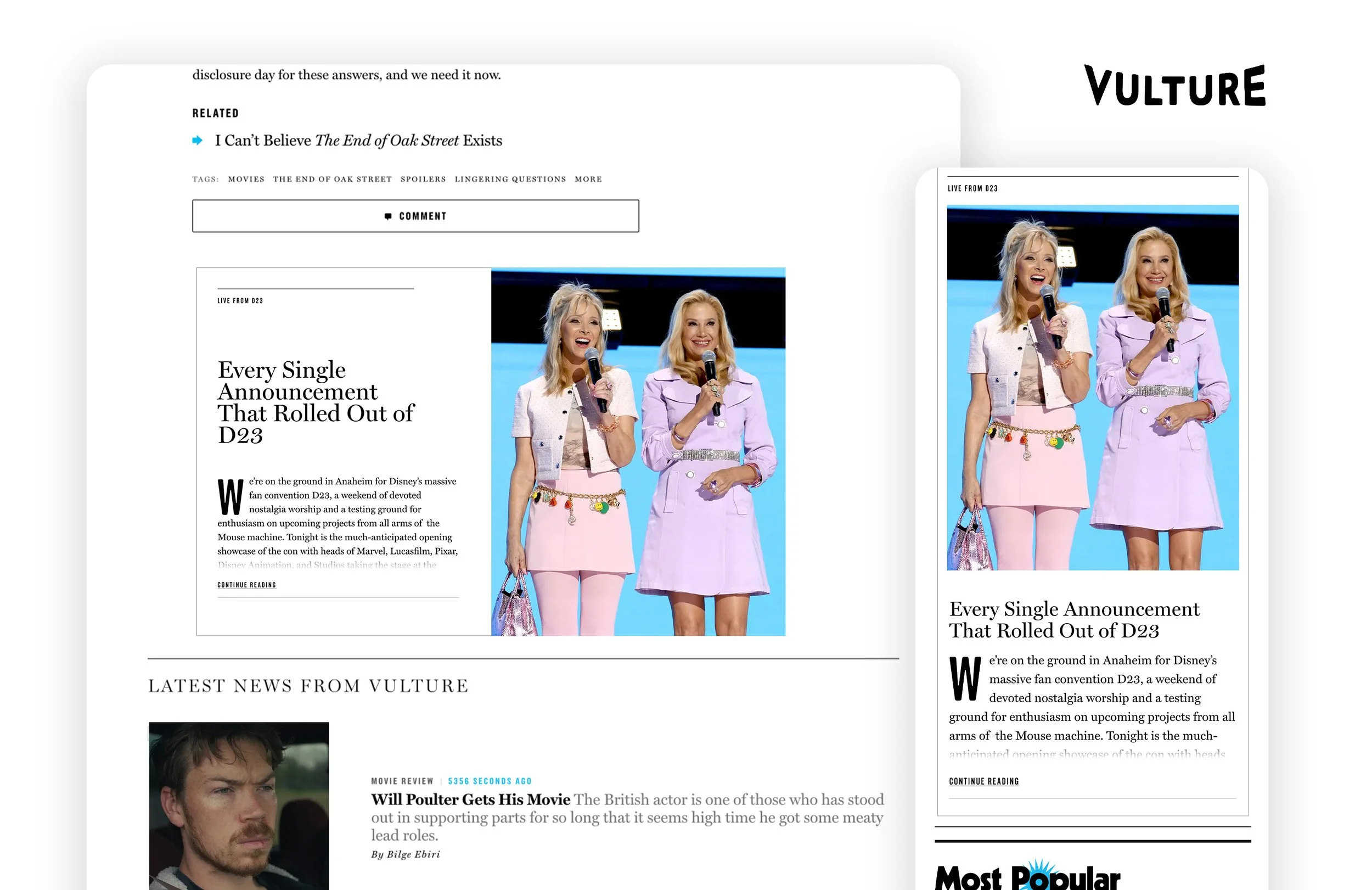
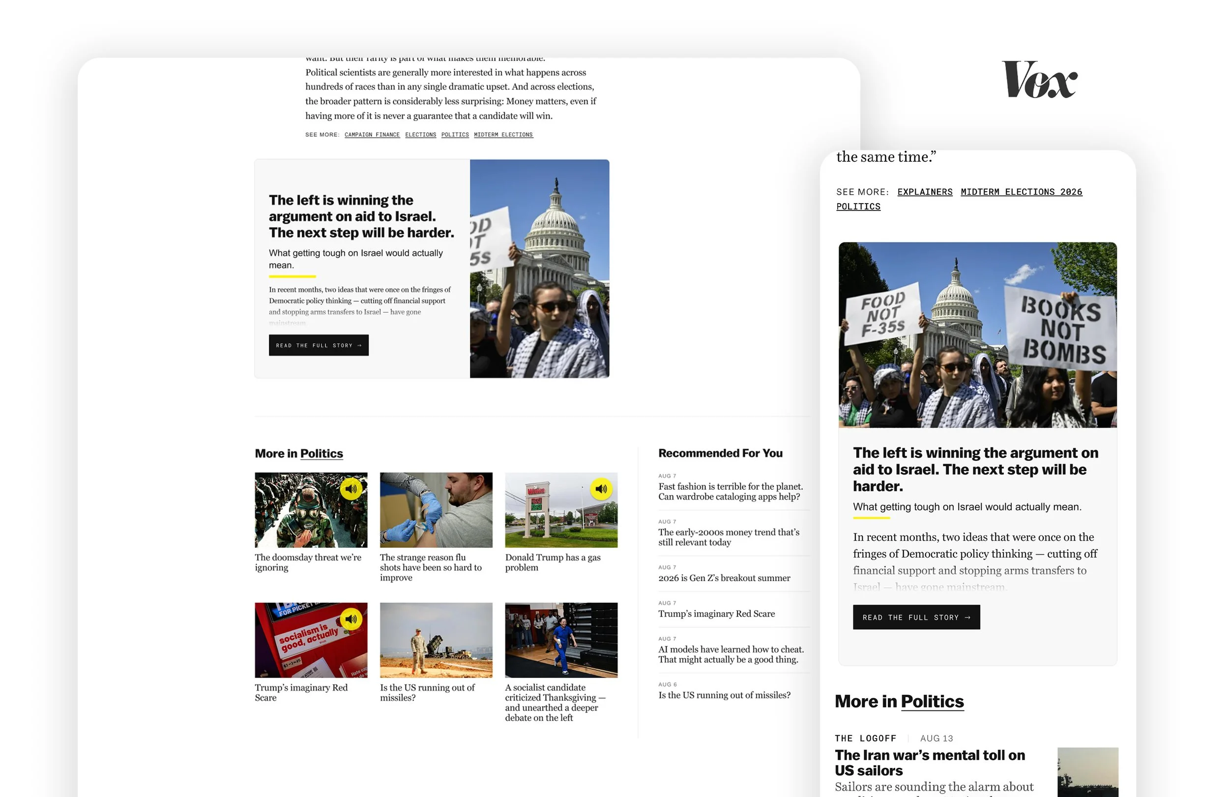
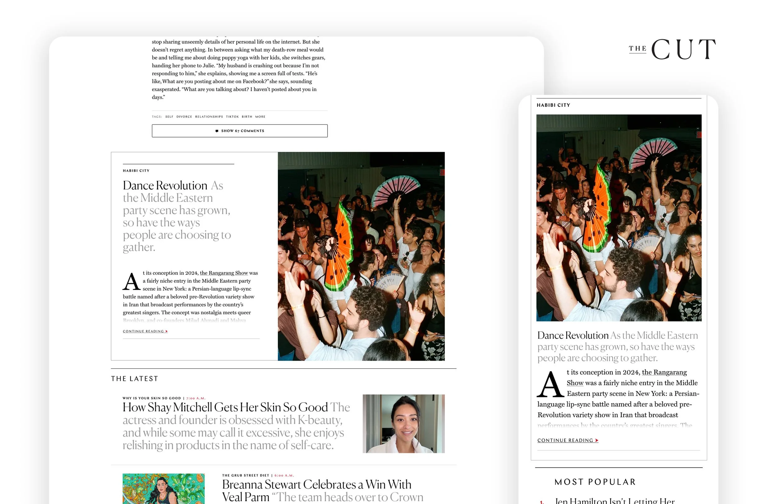
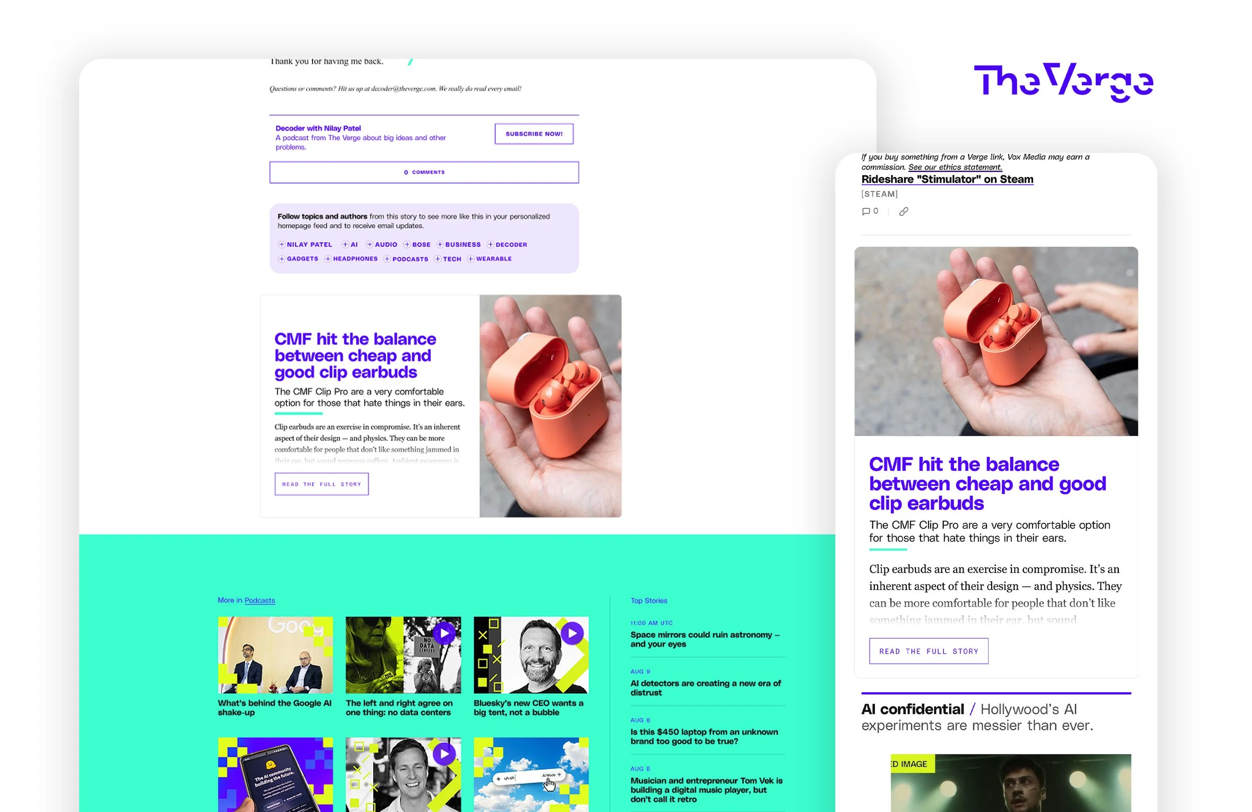
The final product replaced a third-party article recirculation tool with an internal experience that rendered live article content directly from the CMS. Instead of asking readers to choose from a list of headlines, the tool presented the beginning of another story, making it easier to continue reading naturally.
The tool adapted across desktop and mobile while inheriting each publication's typography, colors, and editorial styling. We created two reusable templates that preserved the identities of Vox Media and New York Magazine publications and kept the engineering implementation manageable.
-
![]()
NY Magazine | Vulture
-
![]()
Vox Media | Vox
-
![]()
NY Magazine | The Cut
-
![]()
Vox Media | The Verge
Outcome
Reduced annual distribution costs
Reduce annual distribution costs by 6% by replacing a licensed third-party article recirculation tool. (Based on internal reported savings)
Exceeded early projections
The tool generated 17% more savings than projected during its first three months after launch, validating the decision to replace the third-party solution with an o&o product.
Scaled across multiple platforms
Built a single tool that served two brand families and adapted across three CMSs.
Reflection
Good products solve business problems and user problems together
This project started as a cost-saving initiative, but the solution only worked because it also created an excellent reading experience. Readers were more likely to continue into another article when the transition felt natural, which then allowed the business to reduce reliance on a third-party tool. It reinforced that the strongest product decisions create value for both the business and the users.
Scalability shouldn't come at the expense of brand identity
My first instinct was to design a single experience that worked everywhere. Through collaboration with Editorial, Product, and Engineering, it became clear that preserving each publication's identity was more important than enforcing complete consistency. Creating two reusable templates required a little more engineering effort, but it avoided a much larger maintenance burden than building custom solutions for every publication. It was a good reminder that the most scalable solution isn't always the one with the fewest versions.