Selected Product Work
Concert Marketing Website Expansion
Closing the gap between prospect and client
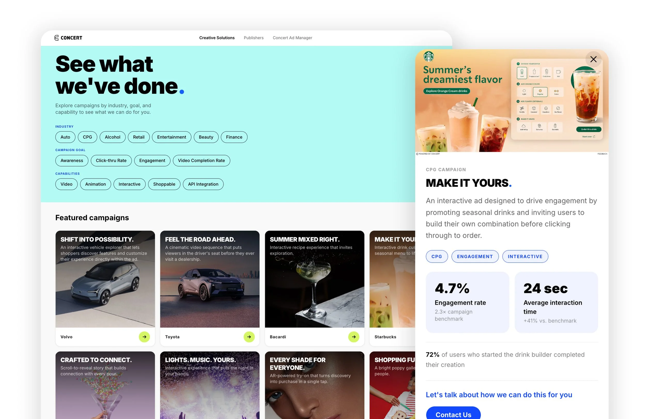
Expanded Concert's website with a new marketing experience designed to increase client conversion and shorten the sales funnel.
At a glance
Concert's marketing site was built to communicate the strength of the platform through audience reach, publisher quality, and brand safety. As the business evolved, I saw an opportunity to better highlight the creative and technical expertise behind the campaigns we were delivering.
I led the marketing site redesign during a company hackathon to explore how the it could better support product discovery and sales conversations.
Outcome: Functional prototype that received strong support from leadership and and positioned the project for future engineering investment.
Role
Lead Product Designer
Timeline
June 2023
Team
1 Sales Lead • 1 Product Director • 2 Engineers • 1 Product Designer (me)
Responsibilities
Product strategy • UX strategy • Information architecture • Competitive analysis • Interaction design • Prototyping
Business Opportunity
Highlight what set Concert apart
Concert's design and engineering teams were creating world-class custom advertising experiences, but those capabilities weren't highlighted in the marketing site. The marketing angle heavily promoted the impressive audience reach but it didn’t explain that advertising with concert also gave advertisers access to a revenue-dedicated design and engineering team ready to take any campaign ideas and turn them into compelling experiences.
By showcasing creative capabilities alongside the platform, the site could help prospective customers see what the Concert team could do for them, giving Sales more compelling examples to pitch and help Campaign Managers discuss platform options.
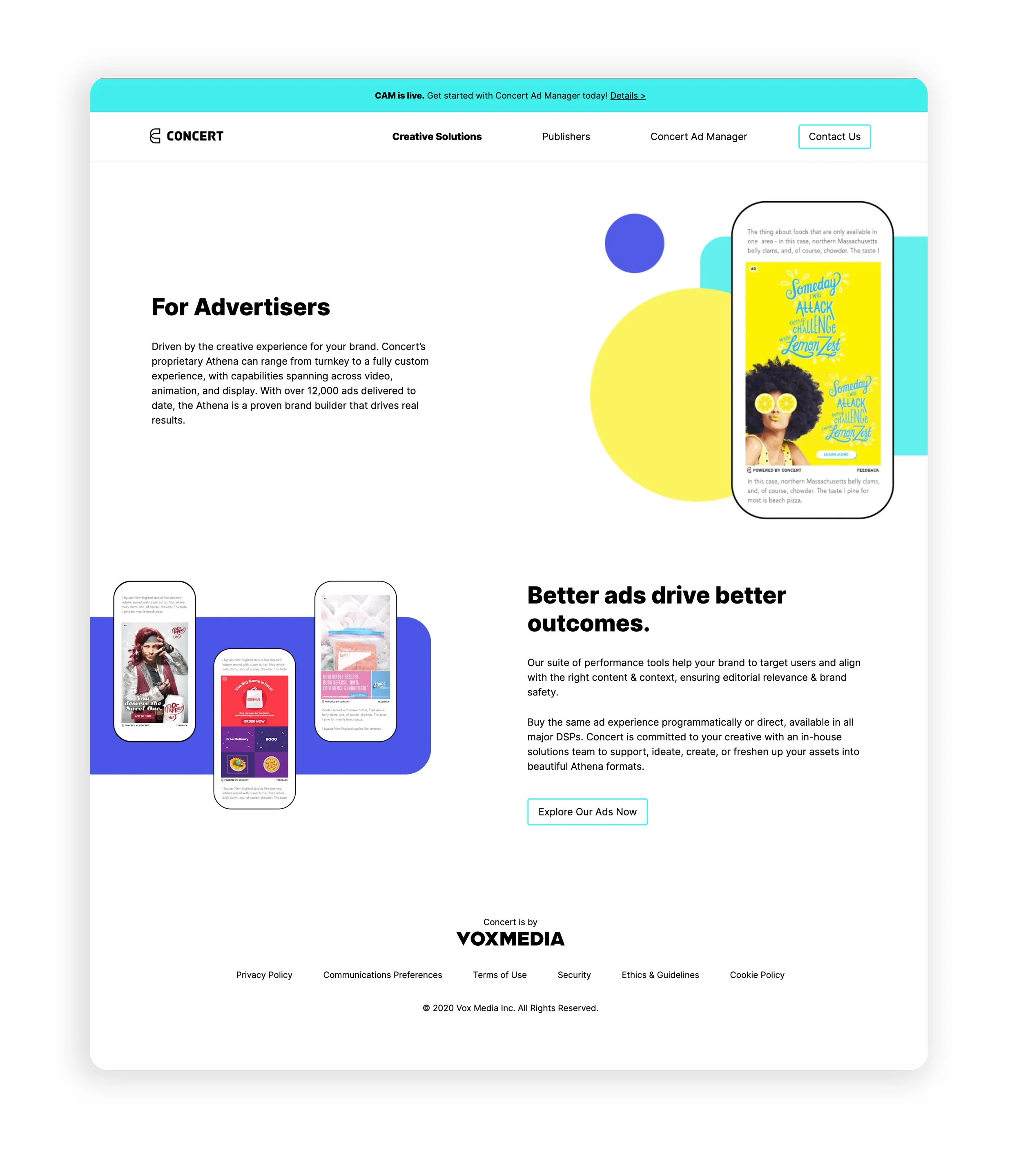
Concert marketing site before the redesign, 2022
The Challenge
Help customers see the full value of Concert.
Concert's website needed to serve prospective customers, Sales, and Campaign Managers, each looking for different information at different points in the buying process. The challenge was organizing the experience so customers could quickly understand the platform while also discovering the creative solutions available to them.
The redesign needed to address three customer questions:
How does Concert reach my audience?
Communicate the value of the platform through publisher quality, audience reach, and brand safety.
What can Concert build for me?
Show real campaign examples, custom advertising options, and client success stories.
How do I know what's right for my campaign?
Help customers understand available products and make it clear that Concert customers get access to a revenue-dedicated design and engineering team that can handle the process from ideation to launch.
Product strategy
Increase sales conversions by reducing site visitor drop-off
I focused the product strategy on reducing site visitor drop-off by shortening the path from prospect to client by making Concert’s capabilities easier to explore and helping advertisers discover relevant solutions.
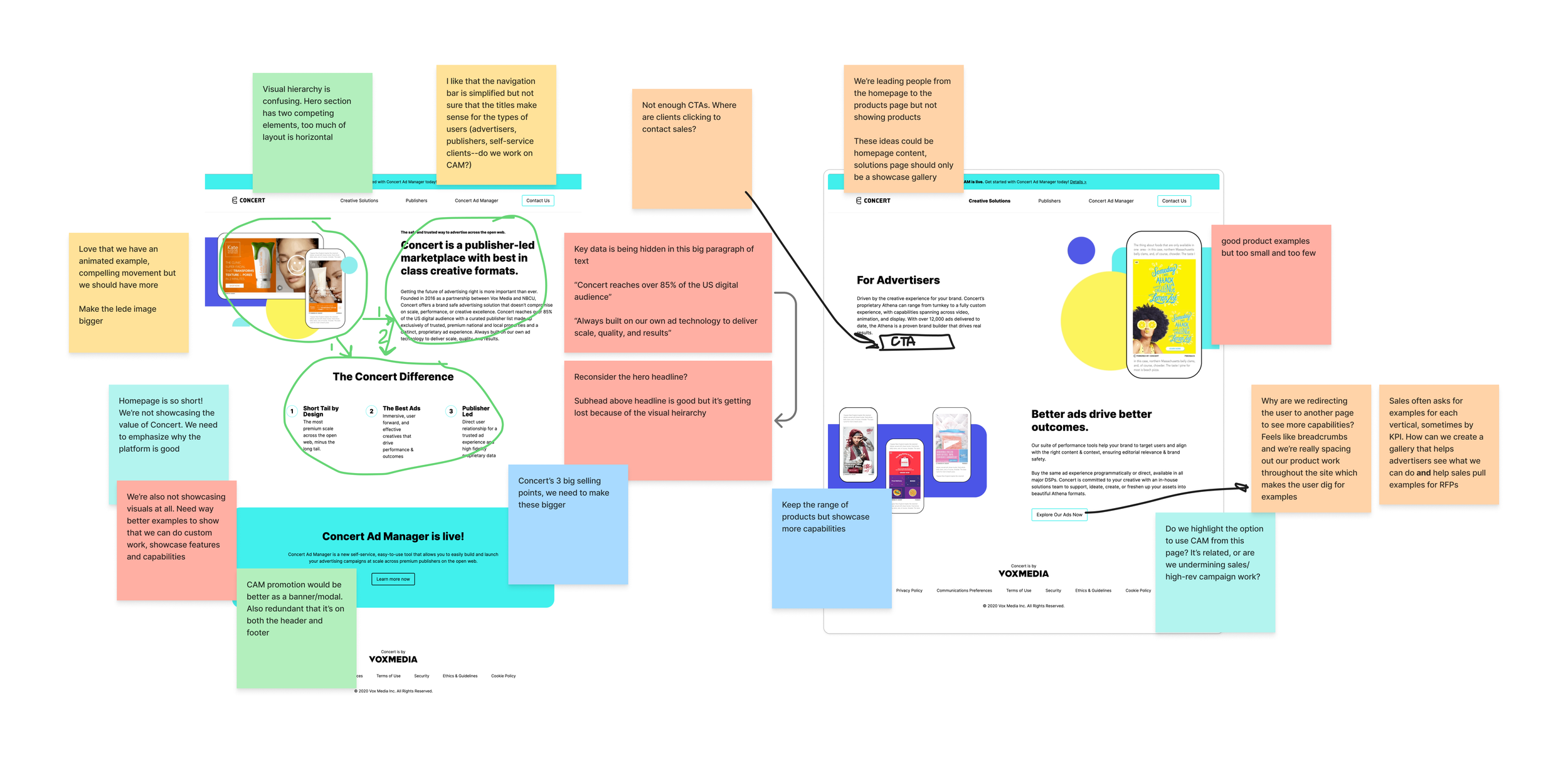
UX Audit of Concert home and solutions pages
Design Process
Understanding the customer journey.
I first needed to understand what customers were looking for at each stage of the buying process. I used competitor research as well as interviews with internal teams to identify what questions clients frequently asked and at what points in the campaign process did they often experience setbacks. Those insights shaped the site's content strategy, information architecture, and page hierarchy.
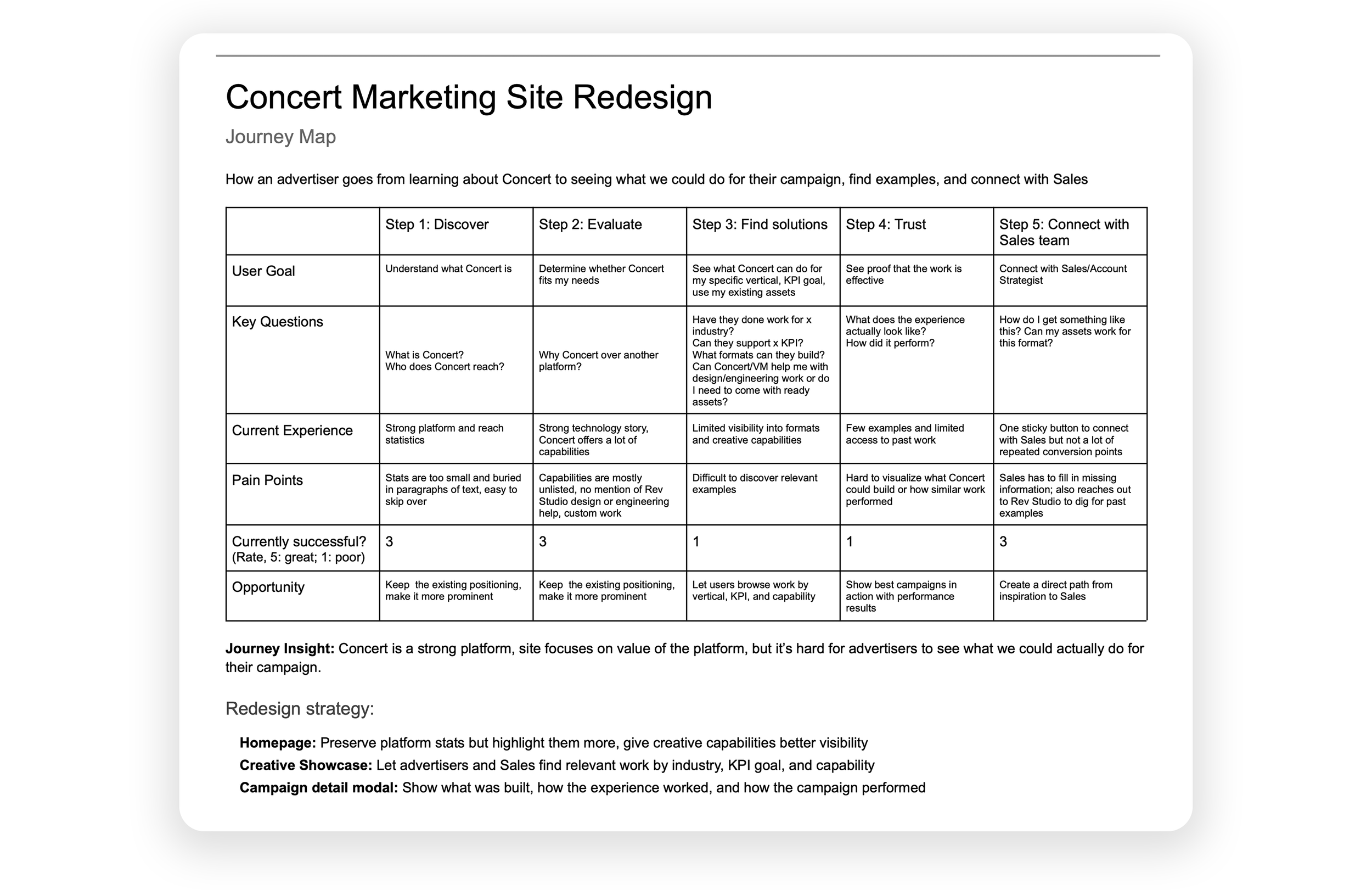
Customer journey mapping
Understanding how competitors sold their products
As a team we reviewed competitor marketing sites to see how they positioned their products and platform. While many sites effectively described their products, the strongest examples helped customers imagine what they could achieve by showcasing past work. I determined that our existing marketing site would be best improved by redesigning the homepage and the showcase of past work.
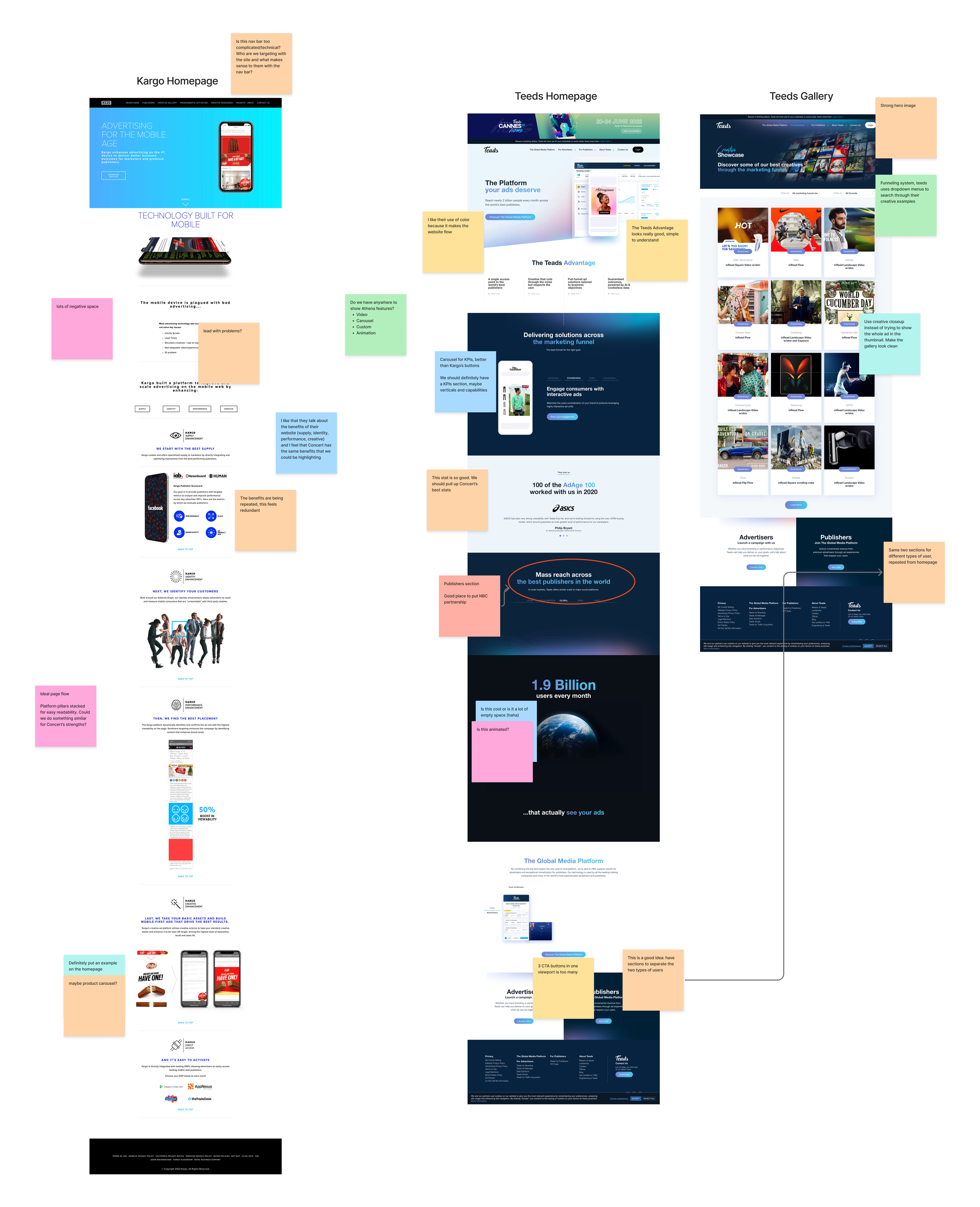
Competitive analysis
Organizing the site around customer questions
I used what we had learned in the homepage information architecture redesign. I reorganized the experience around the questions customers were trying to answer, flowing from the strength of the platform, to the audience reach, and ending with the creative capabilities. The goal was to move naturally from understanding the platform to imagining a successful campaign.
Sketches of the gallery layout and modal overlays
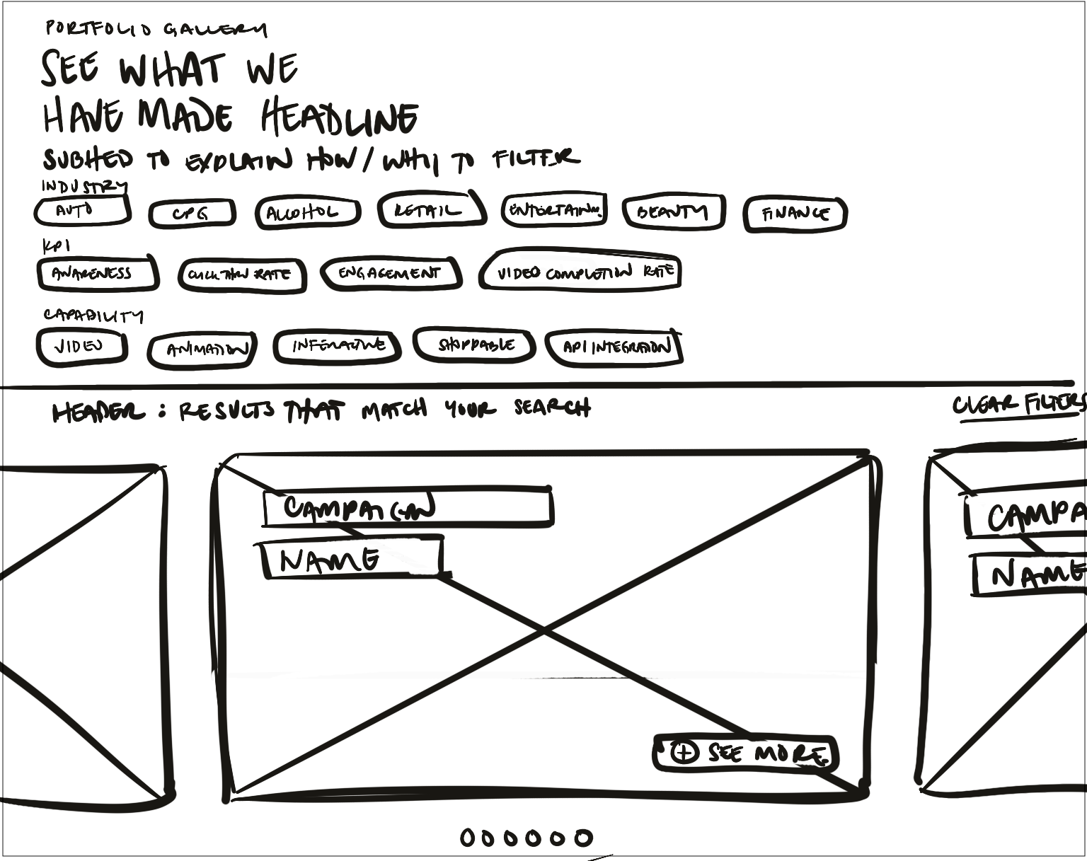
Gallery on desktop
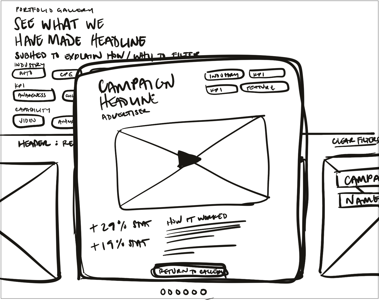
Gallery on desktop with modal overlay
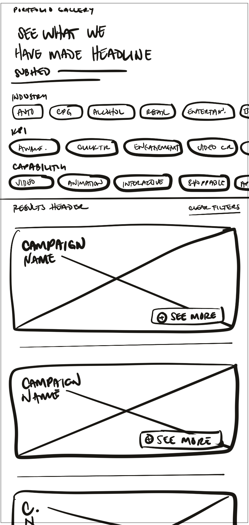
Gallery on mobile
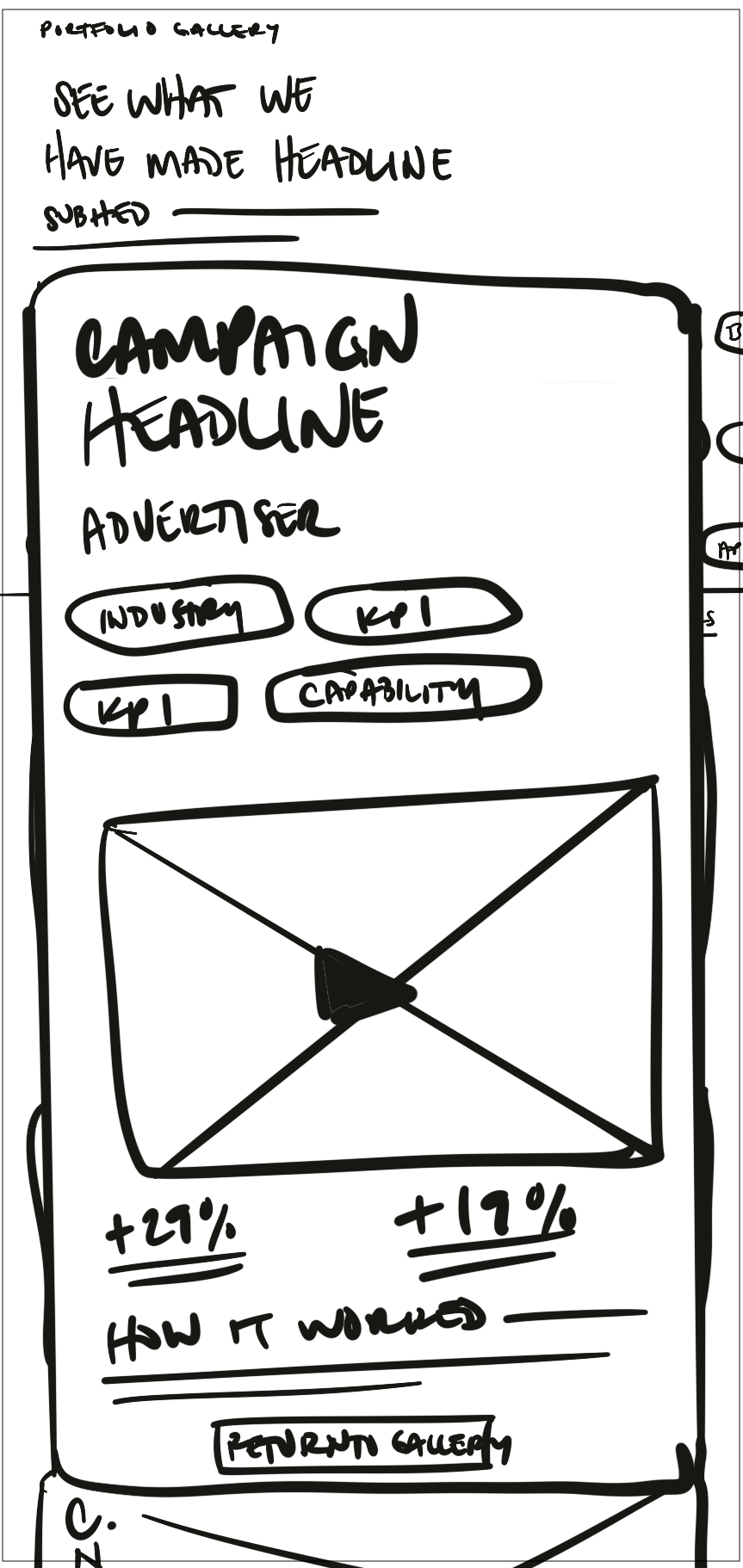
Gallery on mobile with modal overlay
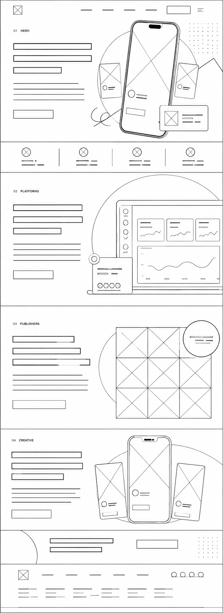
Homepage wireframe
Challenge
Showcase dozens of successful past work examples without creating an overwhelming UI.
I wanted to help clients visualize what we could do for them by showcasing our successful past work. A large image gallery featuring every major industry and product capability would be visually overwhelming, which meant that I had to design an intuitive filtering system to guide customers to relevant inspiration quickly.
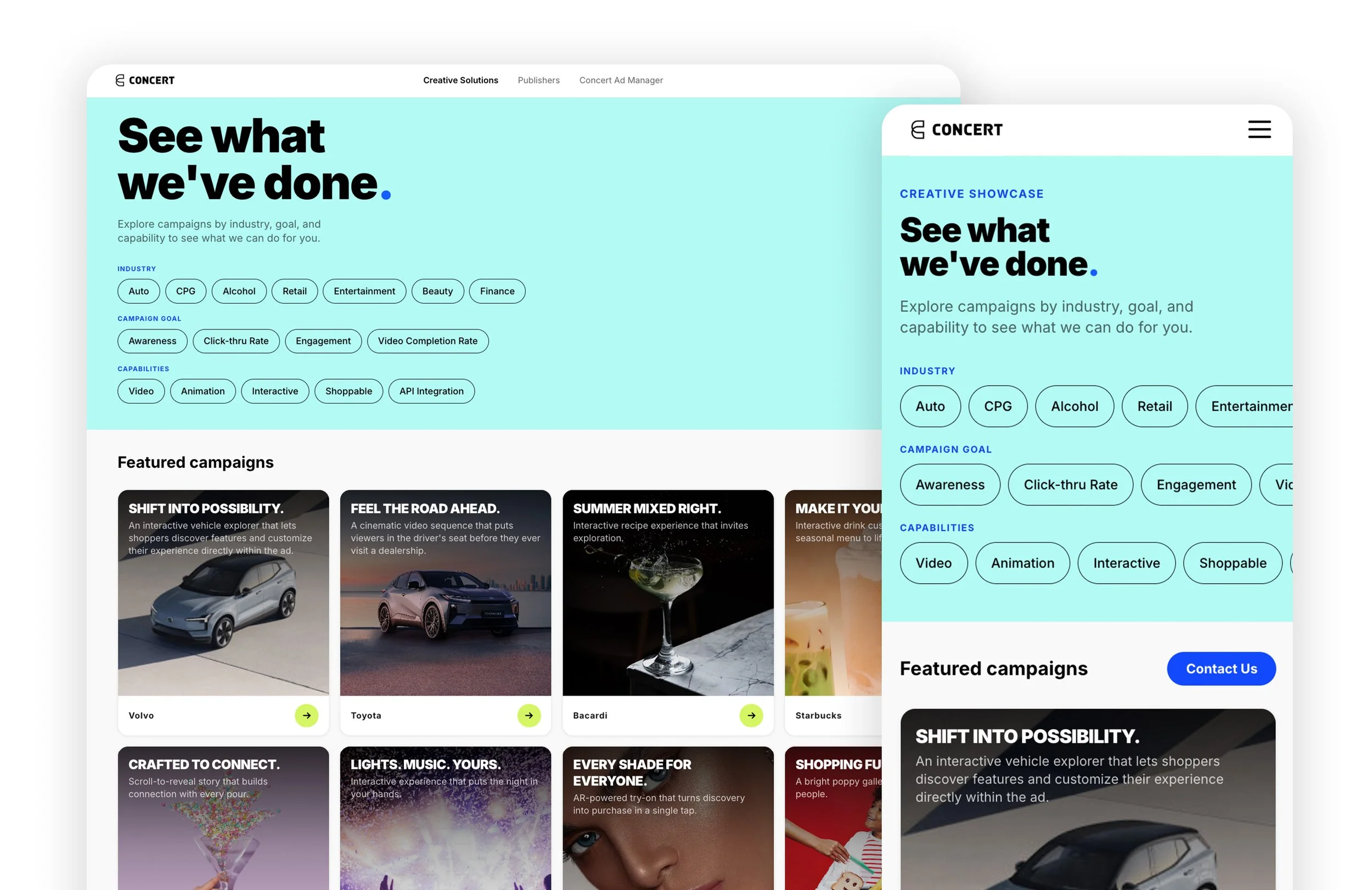
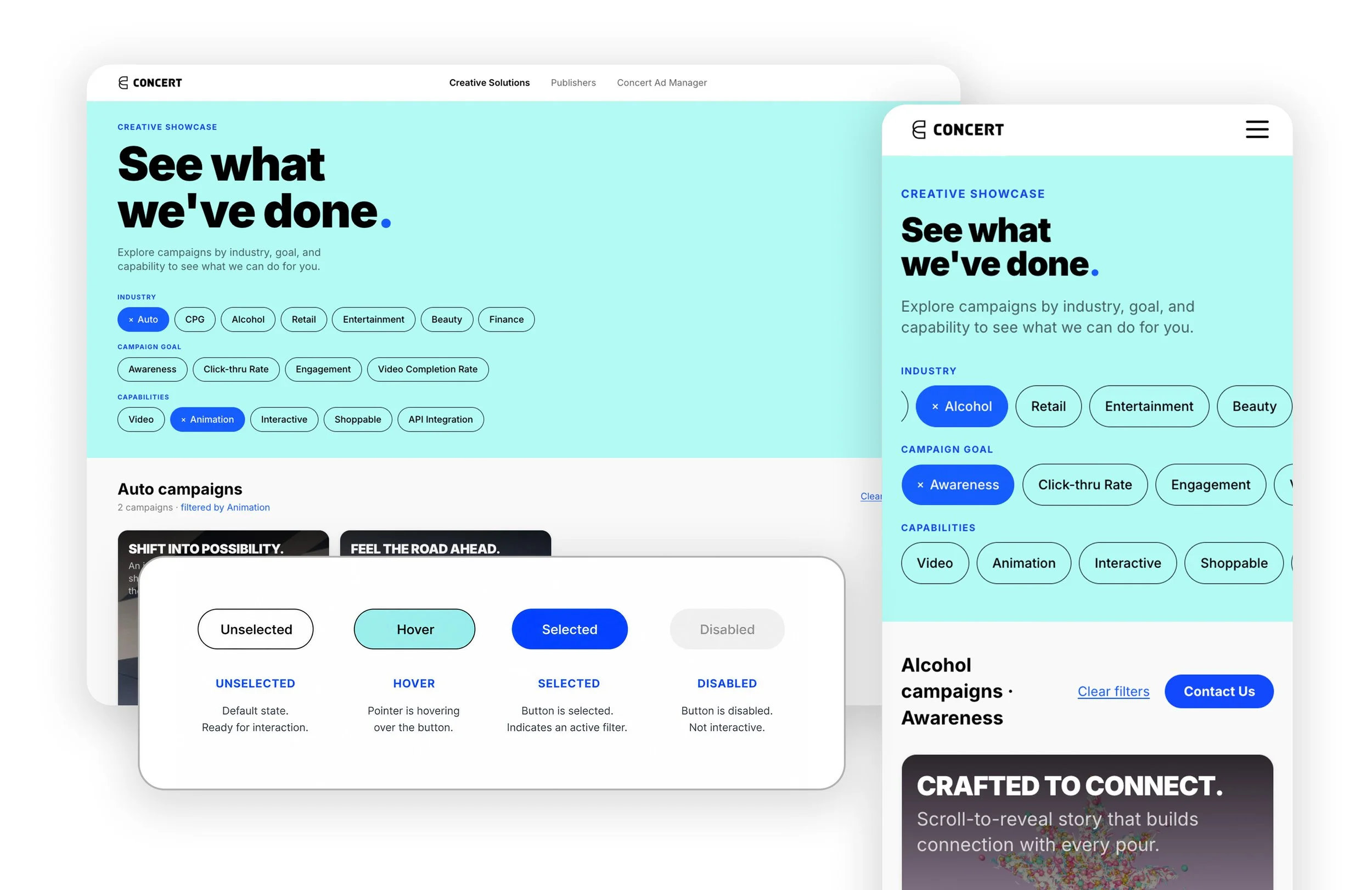
I created a filtering system of clickable sorting chips: Industry, KPI, and Ad Capability. Each chip filters the campaign results, and users can select chips from multiple categories to combine criteria, such as Auto + Engagement + Interactive, and see only the campaigns that match those selections. On mobile, each category is a horizontally scrollable row of chips so users can swipe through filters; this prevented a cluttered mobile filter panel.
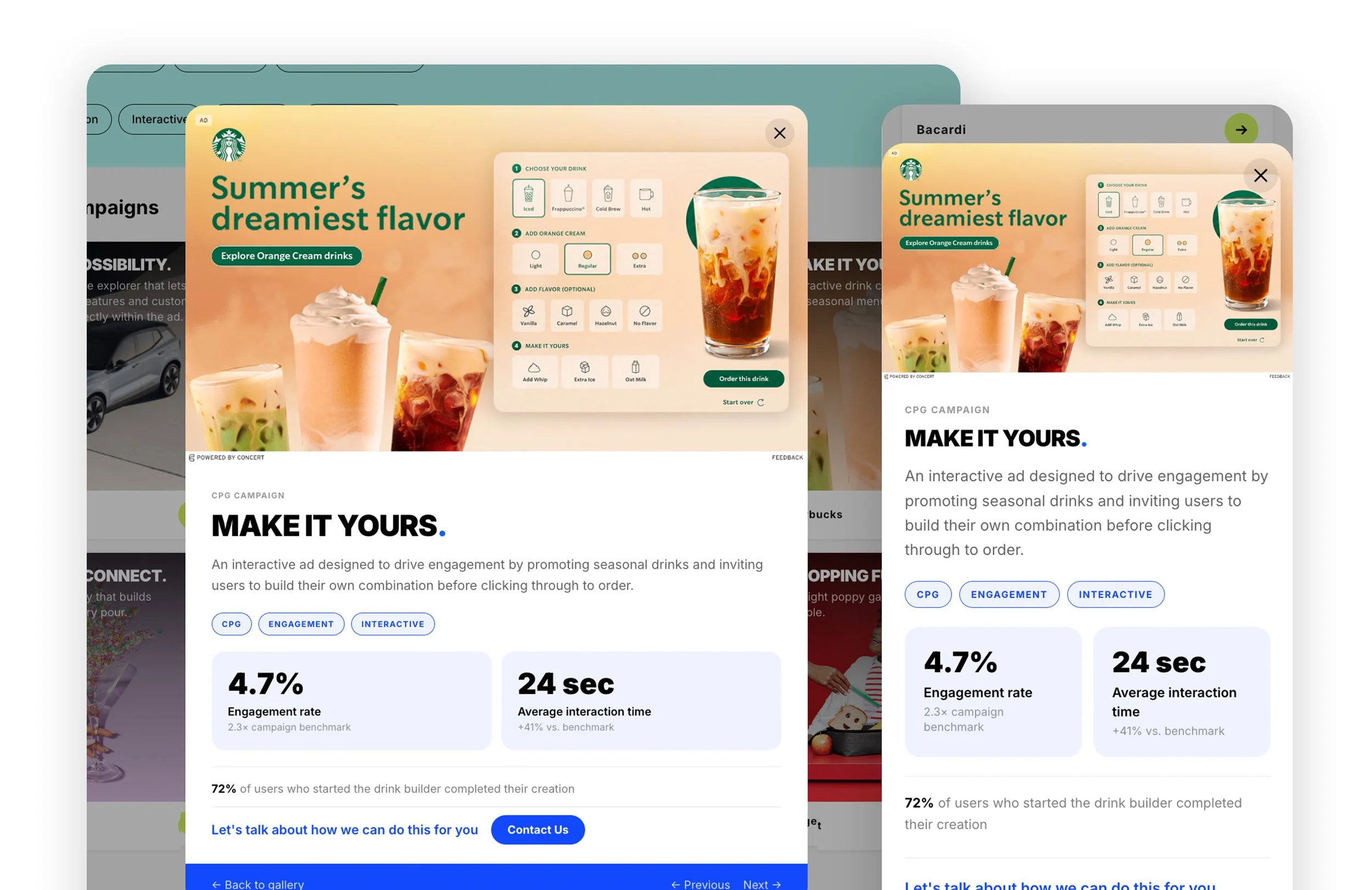
Each result card opens in a modal with the campaign details and key performance results.
Final Product
A marketing site built around customer goals
As a team we were able to complete the homepage and showcase gallery redesign and present a working prototype by the end of the week-long hackathon. We created a compelling new marketing site focused on customer needs. The homepage establishes Concert’s platform strength and audience reach first, then moves into publisher quality and the creative capabilities available to advertisers.
The biggest addition was a new Creative Showcase that makes Concert’s work easier to explore. Instead of presenting a large gallery of campaigns, I created an intuitive filtering system based on the criteria customers are most likely to use. Users can combine criteria to find relevant examples, then open individual campaigns to see the creative, campaign goal, capabilities, and performance results.
The entire website UX gives prospective customers a clearer path from understanding Concert → seeing what it can do → finding relevant examples → connecting with Sales.
Homepage
Introduced a stronger value proposition that balanced platform credibility with creative capability.
Creative showcase
Highlighted custom advertising experiences to inspire customers and demonstrate what the design and engineering teams could build.
Sales journey
Made campaign examples and product capabilities easier to discover throughout the buying journey.
Hompage
Past Work Gallery
-
![]()
Gallery on Desktop and Mobile
-
![Mobile Gallery]()
Creative Showcase across desktop and mobile, with responsive filtering and interaction states
-
![]()
Gallery Content Modal on Desktop and Mobile
Reflection
Solve problems at the source
Through my time with the team, I noticed pain points throughout the marketing → sales → design → operations workflow. Rather than treating them as separate problems, I realized many shared the same root cause (in this case, the information presented in our marketing site). By tackling a workflow point upstream, I was able to improve the outcome for many teams.
Take initiative
This project wasn’t assigned to me, but I saw an opportunity and took the lead in turning it into a product that was well-received by leadership. Working across marketing, sales, design, and operations had given me a broad view of the business, and it reinforced that instinct to trust that perspective and act on it.